The colour that looked like a calm, muted green on the swatch turned almost blue once the room was painted. A beige revealed a pink no one had seen before. The white woodwork began to look yellowed. Suspicion usually falls on the paint-mixing shop then — and usually unfairly.
The swatch does not lie. It simply shows a small piece of one surface, in one light, surrounded by other colours. It says nothing about what the same shade will do across fifteen square metres of wall — next to the floor, the woodwork, the textiles and the light from the adjoining room. Moved onto a large surface, colour stops being a sample and becomes space: it enters light and shadow, is reflected in gloss, meets wood and stone. This is why choosing a paint can drag on for weeks and end in disappointment — we hunt for a more perfect shade, though the source of the problem usually lies elsewhere: in the tone of the floor, the white of the ceiling, the degree of sheen, the quality of the light, or the way the colour has been distributed across the elements of the architecture.
For colour in an interior is not a property of paint. It arises only at the meeting point: of pigment with binder, of paint with ground, of matt with light, of one wall with the next. The old craftsmen knew this without theory — a pigment had its price, durability and character in a particular binder, so walls were treated one way, woodwork another, ceiling and ornament another again; colour ordered the room, marked its rank, led the eye through the enfilade. The modernists, too, did not reduce it to decoration: they used it to separate planes, to lead the eye and to set the boundaries of space. History appears in this text, then, not to supply a catalogue of old shades, but to show why choosing a colour from a single fan-deck is such a narrow method — and why what passes today for neutral or obvious has a history of its own too.
This guide runs from the small sample to the palette of a whole house. It does not offer a set of colours good for every interior, because none exists. It offers a method for making decisions.
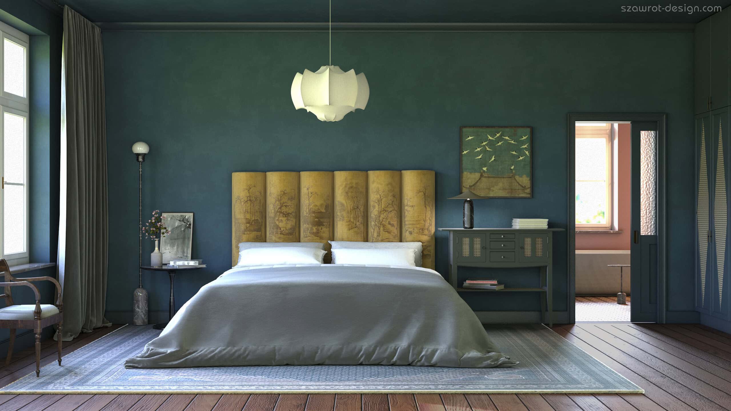 The colour of an interior arises in the relationship between walls, ceiling, woodwork, textiles and light — not in a single sample. Interior design: Szawrot Design.
1. Why colour from a swatch looks different on the wall
The mistake rarely lies in choosing the wrong shade. It appears earlier — in the quiet assumption that a small sample and a painted wall are the same colour at two scales. They are not. A swatch answers a narrow question: what does this field of colour look like, here, on a white card, in this light. A wall answers a far broader one — which is why the paint can be mixed faultlessly and the room still come out other than we promised ourselves.
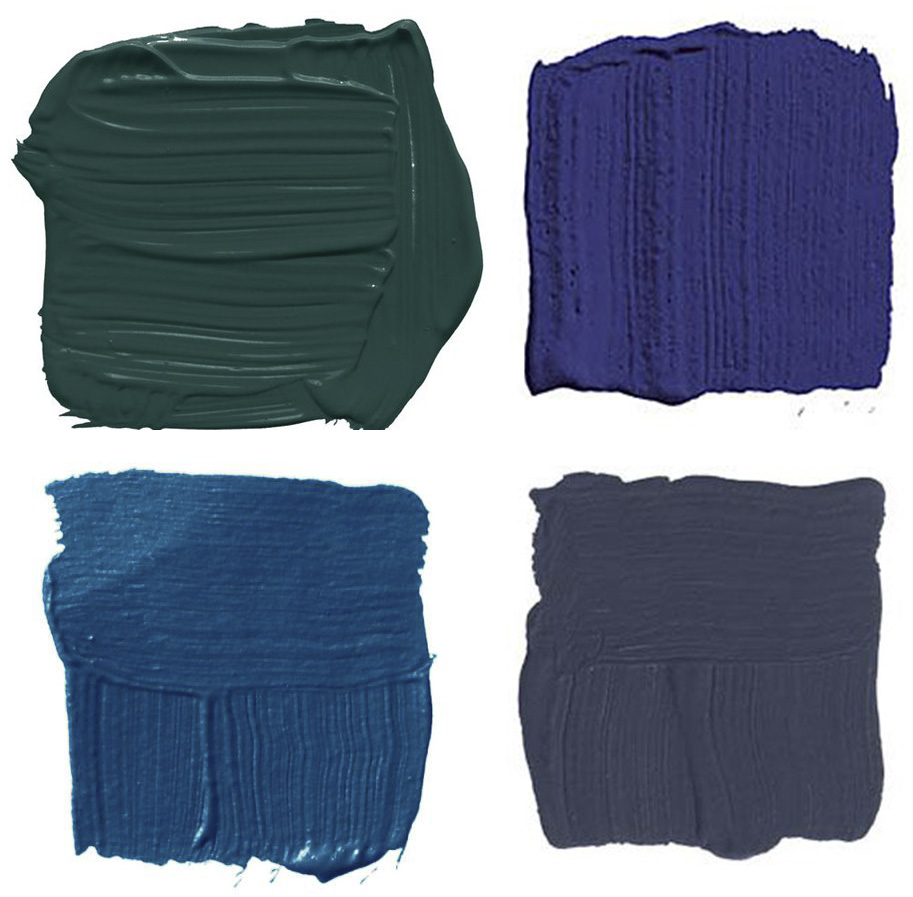
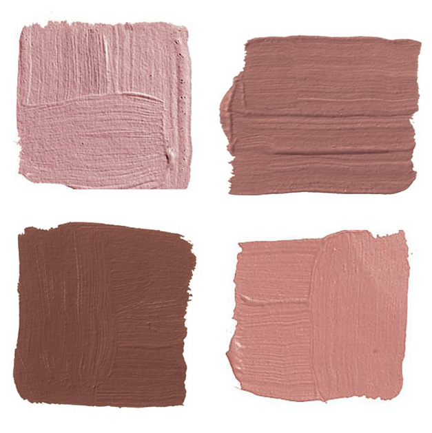
Colour never occurs alone
Josef Albers — painter and teacher, author of the classic Interaction of Color — built his whole teaching about colour on a single unsettling observation: the same shade can look like two different ones if placed on two different grounds, and two different ones can be arranged so that they appear identical. [1] He was not, in this way, searching for a set of perfectly harmonious colours. He was teaching something harder — distrust of what seems obvious at first glance.
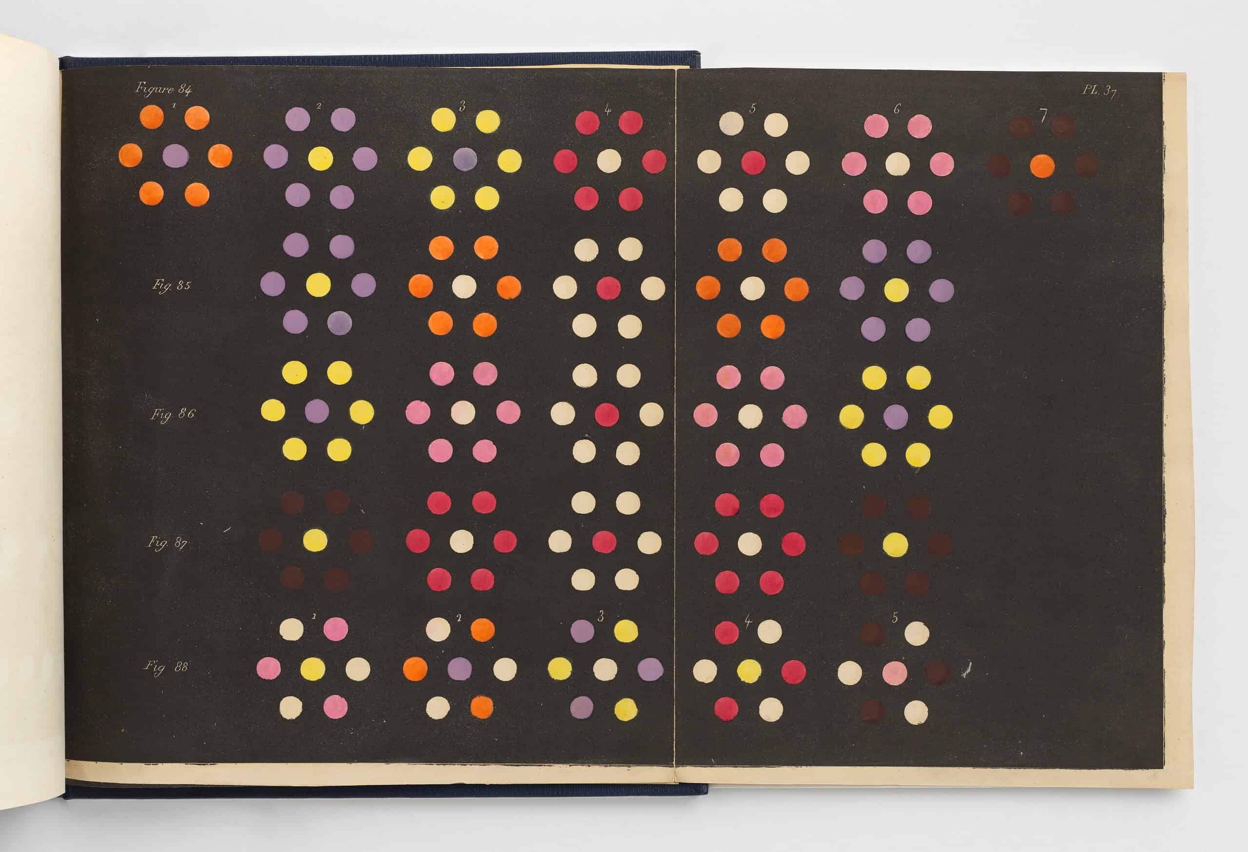 Michel-Eugène Chevreul, plate from the treatise “De la loi du contraste simultané des couleurs et de l’assortiment des objets colorés”, 1839. The arrangements show that we judge a colour in relation to the colours surrounding it. The Metropolitan Museum of Art, public domain.
The eye does not measure colour. It compares it with what lies beside it: a lighter wall, a dark floor, warm wood, cool stone. Grey cools beside honey-coloured oak. White turns blue beside cream woodwork. Green gains force next to reddish wood, though nothing has changed in the tin. This is not an illusion to be cleared away in order to reach the “true” colour. It is simply how colour exists in a room — in relation, never apart.
On a large surface colour looks different
A simple rule gets repeated: on a large surface a colour appears darker and stronger. That is too simple. On a fan-deck card the colour is an accent surrounded by white — of paper, worktop, screen, shop wall — so even a muted shade looks vivid. Once a whole room is painted, the same colour ceases to be an accent and becomes an environment: it is in light and shadow, behind the furniture, in the recesses, in the view through an open door, in reflections off glass and metal. A large field may strengthen saturation — but it may equally lighten it under strong light, subdue it in deep matt, or break it up with shadow and joinery. What changes is not the quantity of paint but the role of the colour: the same navy is a concentrated accent in a shop window, and across four walls becomes the space in which everything else stands.
The interior is a frame of reference
When choosing paint, it is easy to look only at the walls. Yet the floor, the woodwork and the ceiling occupy an enormous part of the field of vision and act more strongly than the subtle difference between two samples. A honey parquet will draw out different tones than grey stone; a cool, pure-white ceiling can make an earthy wall heavier and yellower; “white” woodwork is often, in fact, cream, or yellowed by old varnish. Things not yet present count too — a large curtain, a sofa, a stone chimneypiece will occupy more of the field than a scrap of bare wall. If we are choosing colour in an empty room, it must at least be set against real samples of the most important materials.
Memory is a poor adviser here. We remember character — the sofa “olive”, the stone “warm”, the door “cream” — not the exact relationship of lightness and tone. And the eye adjusts ceaselessly to its surroundings: after a run of warm beiges a neutral shade will seem cool, and after a few minutes in warm light we stop seeing its yellow. This is why the materials have to meet in reality, not in the imagination.
Names, finally, deceive. “Limestone”, “mist”, “linen”, “sage”, “clay”, “old rose” build a mood and help one remember the product, but they will not say whether “sage” beside an oak floor will fall towards grey, mint or olive. The more suggestive the name, the easier it is to fall in love with the idea before one has seen the surface.
How to test colour properly
We test not in order to choose a sample that is pretty in itself, but to see how the colour will behave in this room. First it is worth narrowing the field — ten almost identical shades add no precision, they only blur the differences. Two or three deliberately different samples allow one to compare direction: lighter or darker, warmer or cooler, cleaner or greyer.
For a first assessment the best tool is a portable board of at least A2 size, painted in the intended product and sheen, without a wide white border — a border heightens the contrast and falsifies the reading. The board is carried around the room: by the floor and the skirtings, by the stone and the joinery, on the wall facing the window and on the side wall, in the corner, in the view from the adjoining room. Only after the choice has been narrowed does one make a larger trial on the wall itself, because a board will not show the absorbency of the plaster, the quality of the primer or the mark of the roller. And colour is not judged in one perfect instant: it has to be seen in the morning, on an overcast day, in full sun and in the evening under lamps — not so that it looks the same around the clock (that is impossible), but so that one comes to know the range of its changes. The trouble begins only when, at an important time of day, the colour loses its character: the beige turns pink, the green goes minty, the navy becomes almost black.
How to test colour
- Narrow the choice to two or three clearly different directions.
- Prepare large, portable boards without a wide white border.
- Use the intended product and degree of sheen.
- Compare the paint against real floor, woodwork, stone and textile.
- Move the board between walls, corners and lines of sight.
- Judge it at different times of day and under the planned artificial light.
- Only at the very end, make a larger trial on the intended wall.
2. Colour is a material: pigment, binder, ground and sheen
A code from a fan-deck points to a direction within one system — and no more. It does not remove the differences between wall paint and enamel, matt and satin, skim plaster and old lime plaster. It does not say how the product covers, what texture it makes, how it reflects light. And these are not additions to colour. They are the colour.
Pigment is only the beginning
Pigment gives colour, but is not yet paint. It becomes paint only in a binder — and the same grain of pigment in oil, in lime, in glue and in a modern dispersion yields four different coatings: deeper or more chalky, dense or porous, even or subtly variable. The difference comes not only from chemistry but from physics: from how the binder surrounds the particles and how the finished surface scatters light.
This is why historical colour cannot be separated from technology. Not every pigment tolerated every binder — some lost out to an alkaline environment, others to light, others again demanded exceptionally careful preparation.[2] The choice of colour was at once a choice of material and of method. Limewash is not an emulsion in a “mineral” shade but a different surface: fused with the plaster, dependent on its absorbency, deliberately uneven. Distemper gives a deep matt through its porous structure; oil paint a smooth, saturated and durable layer that, in return, ages together with its binder.
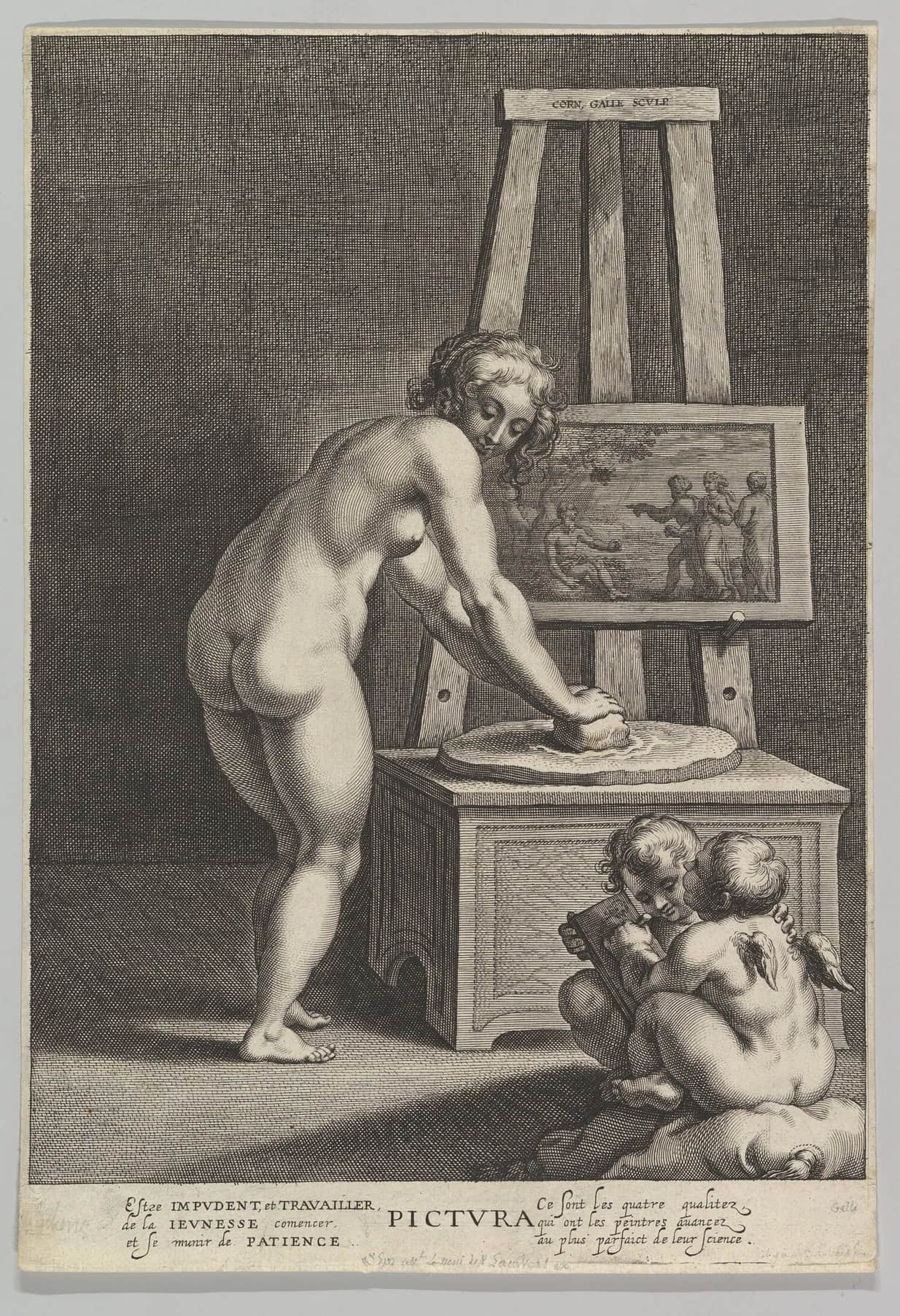 Grinding pigment on a stone slab. Cornelis Galle I after Peter Paul Rubens, Pictura, c. 1610–1650. An engraving of an allegory of painting: a woman grinds pigment on a stone slab. It shows well that pigment was not ready-made paint — it had to be ground, prepared and combined with a suitable medium. The Metropolitan Museum of Art, public domain.
Even the historical names of techniques call for caution. Ian C. Bristow, author of the foundational studies of colour in old British interiors, describes the term dead white: it did not mean “any matt white whatever”, but a specific matt oil finish, requiring the right thinning and a careful hand.[3]
The name of a colour and the name of a technique are not two pieces of information. Together they describe a surface, and how it was meant to react to light.
The green one breathed
How literally colour can be a material is shown best by green. In 1775 the Swedish chemist Carl Wilhelm Scheele precipitated from copper and arsenic a green purer and more durable than anything decoration had known before. He knew it was poisonous. He introduced it anyway — the demand for a good green outweighed any care for who breathed it. A few decades later the recipe was improved in Bavarian Schweinfurt: emerald green, also called Paris green, held its colour for decades, and consisted, by about a third of its mass, of arsenic.[4]
And it was everywhere. Wallpapers, gowns, artificial flowers, toys, tinted sweets. The Victorian drawing room was furnished in a colour that, in a damp room, mould converted into a volatile arsenic compound — the room began, quite literally, to exhale poison. Children in green bedrooms “wasted”. Women weakened in green dresses. The blame was laid on the nerves, the damp, the bad air, the drains — on everything except the wallpaper that had only just been paid for. The English called arsenic “inheritance powder”; in a green room it worked without the help of an heir.
The most famous patterns of the age were designed by William Morris, apostle of honest craft and enemy of factory trash — in this very green, while a good part of the family fortune flowed from a mine belonging to the country’s largest arsenic producers. When clients began to fall ill, Morris pronounced that the doctors had been “bitten by witch fever”, and would sooner look for the cause in the water-closet than in the wallpaper.[5] The pigment gave way not to argument but to the market: a sick client proved worse for business than a healthy one.
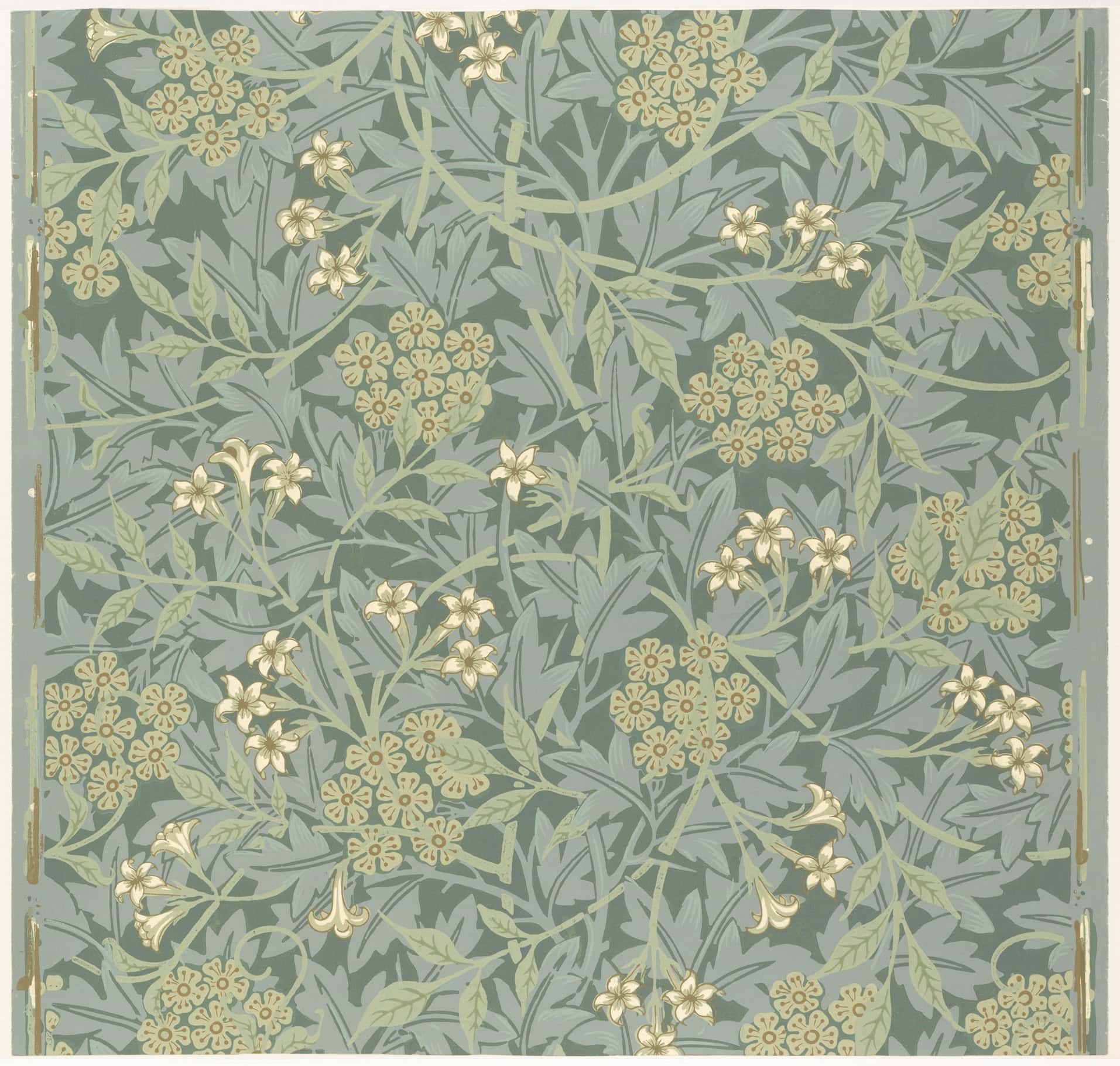 Morris’s green wallpapers are among the icons of good craft — and among the signs of an age in which green could be literally poisonous. The designer, at once director and shareholder of Devon Great Consols, the country’s largest arsenic mine, made light of the alarm to the end: in a letter of 1885 he wrote that the doctors had been “bitten by witch fever”. Later analyses confirmed a copper-arsenic salt in his greens. The “Jasmine” pattern (1872) was built from three shades of green. William Morris, Jasmine, produced by Morris & Company, printed by Jeffrey & Co., 1872. The Metropolitan Museum of Art, inv. no. 23.163.4j, public domain.
No swatch said any of this. The shade was beautiful, durable, modern. The poison was not a defect of the colour — it was that colour: its binder, its price, its durability and, this time, its dose. Honesty requires the addition that the legend outgrew the facts — later researchers temper the tale of a mass slaughter by wallpaper, and the green fell out of use rather because it stopped selling than because it was banned. The shade itself is harmless today. Conservators of nineteenth-century wallpapers put on gloves all the same.
Colour arises on the surface
What we call the colour of a wall is the result of paint meeting a particular ground — and a particular sheen. A deep matt scatters light: the surface quietens, evens out, forgives unevenness, though in dark colours it can polish locally under the touch of a hand. Semi-matt and satin reflect light directionally, so they draw: on doors and panelling they underline the profiles and the rhythm of the panels; on a large curved wall, every ripple of plaster and every trace of a repair. Sheen does not so much “reflect more light” as change how we read the geometry, the texture and the depth of the colour.
Just as strongly, though less spectacularly, porosity acts. Distemper covers not only by its pigment but by a microstructure that scatters light — which is why, in the conservation of such coatings, too generous a saturation with a consolidant fills the pores and visibly darkens the colour, though the pigment has stayed the same.[6]
The physical build of the surface changes, and with it the colour we see. The ground behaves likewise: the same paint on skim plaster, old lime plaster, wood and MDF will give four different effects, depending on the primer, the absorbency, the grain, the earlier coatings and the manner of application. Unevenly prepared patches of wall will come to light above all in raking light.
And nothing ends on the day it dries. Pale oil coatings yellow over time, most strongly where light has long been kept out[7] —
the patch behind a picture is often yellower than the exposed wall, not because it “better preserved” the original colour, but because it aged differently. Other surfaces chalk, go matt, grey with dirt. Patina can be a beautiful witness to time; a faithful image of a freshly finished interior it almost never is.
The same shade, a different effect
One colour on the walls, the skirtings and the doors binds an interior well — but identity there will not be, and should not be. Wall paint and enamel have a different binder and a different sheen; plaster is a large, relatively even plane, while a door is a set of edges, profiles and recesses over which light falls unevenly. The same shade on a wall can be gentle and dry, on the joinery deeper and darker. Often it is precisely this small difference that saves a monochrome composition from flatness.
There are several strategies, and each can be good: a single shade to which material and sheen add a nuance; two close colours, when the relationship is to be controlled; a clear contrast of wall and joinery, when the interior calls for it. What matters only is that the decision does not follow from the belief that “all the white elements should be the same”, or that a catalogue number guarantees the same effect on plaster, wood, MDF and metal. The aim is seldom laboratory identity. More often — a deliberately designed difference.
Paint is part of the design
The choice of paint does not end at a name and a code. One has to settle the ground and the primer, the degree of sheen, the manner of application, the resistance to cleaning and the possibility of local touch-ups, the behaviour in raking light, the compatibility with earlier coatings — and the effect on a large surface. A superb shade on the wrong carrier gives a disappointing result; a perfect coating will not save a colour placed at random within the architecture. Technology and composition do not compete. They are two halves of the same decision.
The most important points
- Record not only the code but also the maker, the product line and the sheen.
- Test a trial on a ground as close as possible to the intended one.
- Do not assume the same code will be identical in wall paint and in enamel.
- Judge the surface in raking light.
- Take account of absorbency, primer and earlier coatings.
- Remember that sheen affects the reading of colour as strongly as a small difference of shade.
- With old plasters and coatings, match the technology to the material — in a historic interior, do not reproduce the shade alone while ignoring the character of the surface.
3. There is no single historical palette
Paint manufacturers happily sell “Georgian”, “Victorian”, “palace” and “manor” colours. As a starting point they can be useful: they summon an atmosphere, sometimes a real reference. They become misleading the moment they suggest that an era had one recognisable palette that can be reproduced by buying a few aptly named tins. It did not. The same period produced interiors austere and overloaded, light and dark, quiet and many-coloured — and the differences were decided not only by taste but by technology, the availability of materials, the wealth of the owners and the rank of the particular room.
In the well-documented British interiors, Ian C. Bristow distinguishes a group of widely used common colours: whites, creams, stone tones, pearl, lead, chocolate, the colours of panelling.[8]
They were not a neutral background for the “real” decoration — they built the essential structure of the room and worked with the joinery, the gilding, the textiles, the graining and the marbling. A light wall, darker joinery, glossy doors and a patterned fabric could compose a far richer whole than the mere list of colours used would suggest. For before industrial standardisation, paint was a workshop product: the pigment had to be bought, ground, bound with the right binder and laid on a prepared ground. Each of these steps cost — and cost differently.
Colour had a price, a rank and a place
In the price list of the London tradesman Alexander Emerton of 1734, the basic whites, creams and stone colours cost four or five pence a pound. The best deep green — thirty.[9]
A sixfold difference in a single price list is not an accounting curiosity but a principle of furnishing: the dearer pigment went where it mattered most — to the show room, onto the joinery, onto a moulding visible from an important axis — and the cheaper everywhere else. Drawing room, study, bedroom, stairs and back rooms differed in their light, their use and in who was to see them; colour helped to show those differences. The palette of a house was a map of its spending.
There was, at the same time, no simple dictionary of function: green did not automatically mean repose, red state, blue the bedroom. In some eighteenth-century interiors chocolate or mahogany doors were set against mouldings in stone and pearl tones[10] —which, to an eye used to uniformly white joinery, can come as a surprise. This is why, in analysing a historic interior, the question “what colour was used” is only half the question. The other half runs: on what surface, set against what — and why was it decided, precisely there, to bear its cost?
The principle “a colour costs, therefore it means” was not born in eighteenth-century London. Its pedigree is far older and more ruthless.
The purple one was born into
The most expensive colour of antiquity came neither from a mine nor from a plant, but from a snail. From the gland of the sea snail murex seeped a drop of colourless slime that, in the sun, passed through yellow and green until it set into purple — a colour that did not wash out and did not fade, against almost everything else then used for dyeing. A drop per snail; thousands went into a single gram of dye. The Phoenician cities of the Levantine coast, Tyre foremost, lived by this trade and stank of it across the whole bay: heaps of crushed shells, vats of rotting glands, a reek by which a dye-works could be known from afar. The result was a colour priced like bullion — at the close of the empire, purple wool stood in the imperial price edict on a par with gold.[11]
Since it cost so much, the law was quick to settle who might wear it. Roman statutes narrowed full purple to triumphators and the emperor; Byzantium went further and made of the colour a state institution, and of its unauthorised use a crime against authority. In the palace at Constantinople a chamber was fitted out, lined with purple stone, in which the children of the reigning house were born. Hence porphyrogenetos, born in the purple: not a metaphor of dignity but an address. The colour did not adorn that interior — it was it, and it authenticated the person born within it.
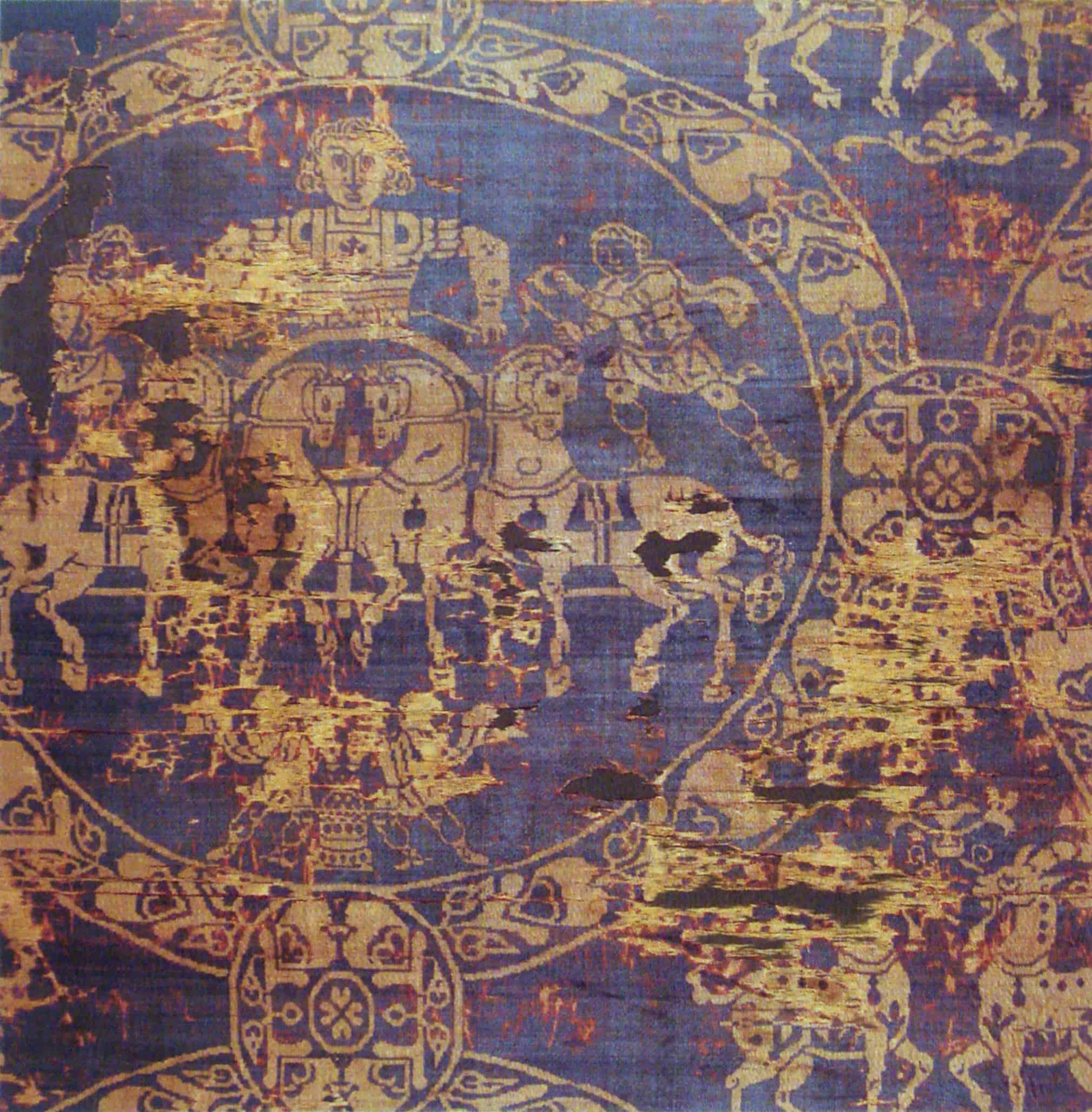 Purple was not laid on walls — it was the colour of textiles, of ranks and of the court, and yet it could furnish an interior. In this silk, woven with gold and Tyrian purple in imperial Constantinople, the body of Charlemagne was wrapped after his death — an emperor of the West in a cloth from the workshop of the emperor of the East. The Shroud of Charlemagne, silk, gold and purple, 9th century, Musée de Cluny (Musée national du Moyen Âge), Paris. Public domain.
This is the rank of a colour in its pure state. Purple did not mean power because it looked dignified — it meant it because few could afford it, and the law forbade it to the rest. The meaning did not lie in the shade. It lay in the price and in the prohibition. The secret, moreover, was guarded so closely that, with the fall of Byzantium, it simply lapsed; the composition of the dye was not deciphered until 1909, and proved a close relative of common indigo.[12]
The imperial privilege and the snail’s slime were separated, as it turned out, by two atoms of bromine — and by a dozen centuries in which no one knew it.
The blue that fell by nine tenths
Purple was killed by time. Blue was disarmed by chemistry — and by mistake.
Before blue became a cheap colour, it was a measure of wealth. A deep, durable blue meant ultramarine: ground lapis lazuli, carried from the mountains of what is now Afghanistan, priced like bullion. The painter did not lay it where it was pretty, but where it was most important — on the Madonna’s mantle, on that one surface meant to dazzle. Blue was not a shade. It was a bill put on show.
It ended in a Berlin workshop around 1705. The colour-maker Diesbach was boiling a red lake; he ran short of potash and borrowed some from the alchemist Dippel — not knowing that the stock was contaminated with the residues of animal blood. Instead of red, a deep blue precipitated. The first modern synthetic pigment came not from design but from a dirty vessel.[13]
The new blue — it was named Prussian — was durable, non-toxic and cost about a tenth of ultramarine. The recipe was guarded as a secret until, in 1724, it reached print; then blue factories sprang up all over Europe. In half a century a colour that for centuries had said “I can afford it” became available to anyone who could afford paint.
The rank did not lie in the blue. It lay in the price — and the price collapsed. As chemistry took the colour down from the shelf reserved for the rich, it stripped it of meaning at the same time: a deep blue on the wall stopped saying anything about its owner beyond that he liked blue. The pigment itself did splendidly — Hokusai and Picasso painted with it, and today it is a medicine, an antidote in poisoning by thallium and radioactive caesium. Scheele’s green killed in the bedroom; the blue born of a mistake found its way onto the list of life-saving drugs.
 The deep blue of sky and sea is, in large part, Prussian blue — a cheap, synthetic pigment that travelled from a Berlin workshop as far as the workshops of Edo. The Metropolitan Museum itself notes that Hokusai built his landscapes from indigo and imported Prussian blue. Katsushika Hokusai, Under the Great Wave off Kanagawa (Kanagawa oki nami ura), from the series Thirty-six Views of Mount Fuji, c. 1830–1832, woodblock print, ink and colour on paper. The Metropolitan Museum of Art, inv. no. JP2569, public domain.
Naming colour: a system against the vagueness
If price and prohibition gave colour its meaning, its names gave endless trouble — and the trouble is old. Long before paint charts, naturalists faced a practical version of the swatch problem: how to record the exact blue of a bird’s wing or the precise green of a mineral, in words, so that another observer would see the same thing. The most influential answer was Werner’s Nomenclature of Colours. The system of the German mineralogist Abraham Gottlob Werner was set out in 1814, and expanded in 1821, by the Scottish painter Patrick Syme, who fixed each of some hundred-odd colours to a painted swatch and to concrete referents from the animal, vegetable and mineral kingdoms. “Berlin blue” was not a word but the wing of a jay, the petal of a hepatica, a piece of sapphire. [14] Charles Darwin took the book aboard the Beagle for exactly this reason. And yet even Werner’s careful system, as its modern editor Patrick Baty observes, lays bare how endless the project of classifying colour really is. The lesson is double: naming colour by concrete things is far more honest than the evocative names of a catalogue — and even the most rigorous naming never quite closes the gap between the word and the surface.
The moral for the whole chapter: since the meaning of a colour hung on price, availability and law, there could be no such thing as a “palette of the era” — there were palettes of fortunes, of regions and of ranks. Exactly this becomes visible when, from the grand history, one returns to ordinary houses.
One era, many interiors
Historical colour names tempt with an apparent precision. French grey, stone colour, pearl colour, drab sound like passwords to which one right catalogue equivalent could be assigned today. In reality they denoted families of colours, not recipes: the look of the paint was decided by the pigments and their proportions, the binder, the ground, the execution, the place and the practice of the particular workshop. Two paints both called stone colour could belong to a similar group of light tones and yet differ clearly in shade, covering and reflection. The documents of the age are, moreover, sparing — a bill names “grey paint”, because maker and customer knew what was meant; the obvious was not written down. This is why a note about French grey does not yet give an equivalent in RAL or NCS. It has to be set against the surviving layers, the kind of surface and the history of the room — only several traces together indicate which family the colour belonged to and what role it played.
Time complicates matters. Novelties spread slowly, the old lasted long, and renovations rarely took in everything at once. In one room there would meet: joinery from an earlier phase, a new cornice, a later wallpaper, doors repainted in passing, furniture brought from elsewhere, textiles already of the next fashion. The colour scheme of a house accrued in layers, as the house did. “A palette around 1780”, then, can be a useful point of orientation — an answer it never is. Bristow’s studies are priceless not because they hand over a ready palette for Europe, but because they show how many participants each such decision had: the price of materials, the local market, the hands of the craftsmen, the function of the room, the standing of the owner, a shifting convention.
These questions are, if anything, sharper the moment one crosses a border. A country house in one province, a city apartment building in another, a villa in a third did not belong to a single circuit of materials or patterns — different workshop traditions, trade links and political histories acted on each. Buildings of the same age need not have shared a palette; at most they shared the questions, which each answered with whatever was at hand.
The historical colour scheme of an interior was made not by the walls alone. In this nineteenth-century drawing room the textiles, the carpet, the pictures, the wood of the furniture and joinery, and the light all take part in it. Anonymous, French, Drawing of an Interior: Salon, 1857. The Metropolitan Museum of Art, public domain.
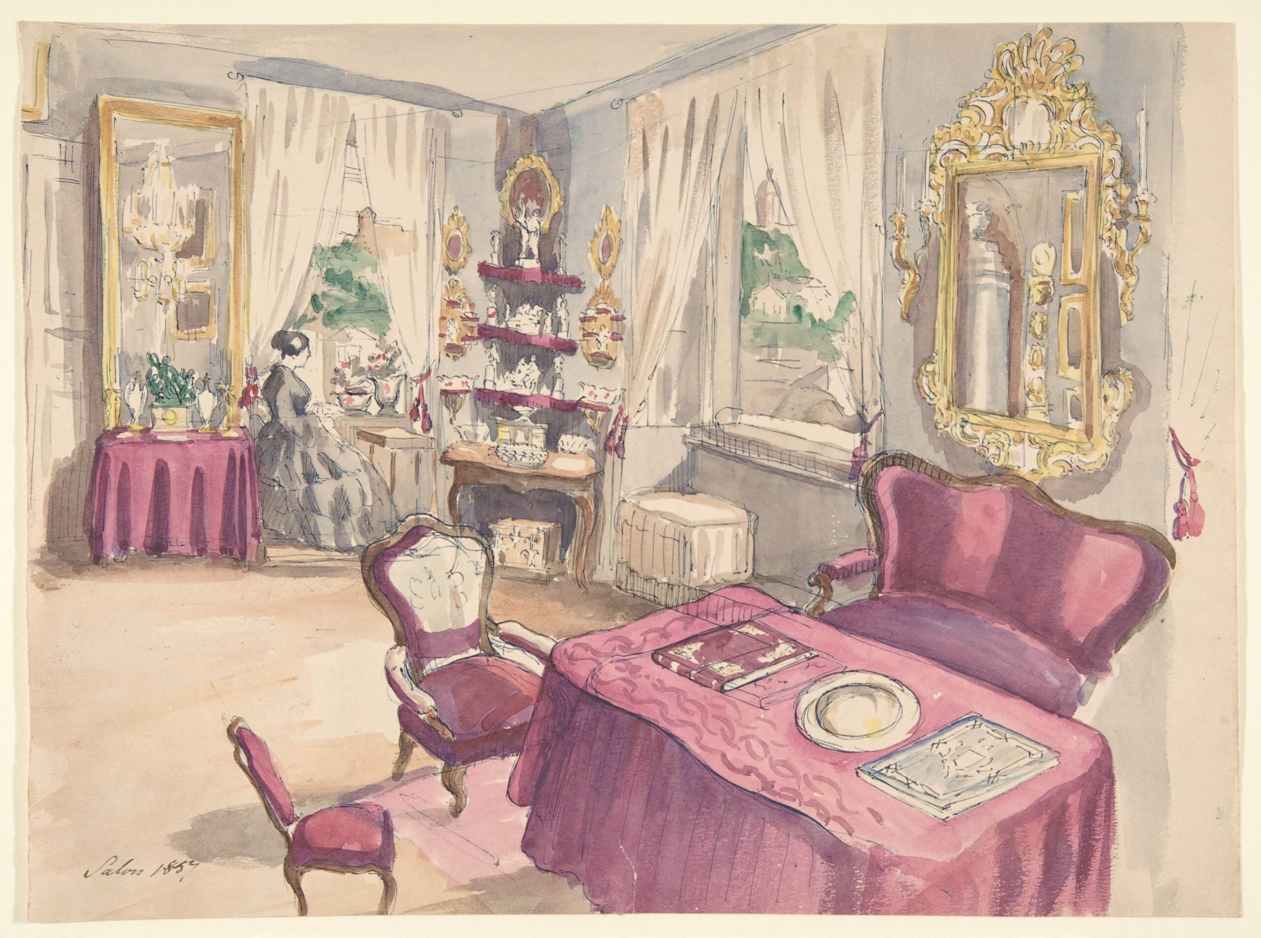
The drawing is a reminder of something else: the palette of a room did not end at the painted surfaces. It was made by textiles, wallpapers, carpets, wood, stone, ceramics, metal, pictures. The same wall colour looked different after a change of curtains — so reproducing the shade alone does not restore the character of an interior, if along the way the relations between a matt wall, glossy joinery and a darker floor have been lost.
And this is not only a matter of distant centuries. There was never a single palette of the recent past either. Our memory of a decade tends to collapse into two images at once — drab utility on the one hand, a nostalgic land of splendid design on the other — when the real interiors sat between them, at the crossing of experts’ schemes, availability, class, aspiration and improvisation. The colour of such a home was carried in by veneers, curtains, ceramics, glass, textiles and objects gathered over years — not by the wall. An era reduced to grey, or to a handful of currently fashionable colours, says more about our memory than about those rooms.
Reconstruction, interpretation or stylisation?
Finding an old colour does not yet settle what to do with a contemporary interior. The same knowledge can lead in three different directions — and the difference concerns not “the degree of historicity” but what the decision rests on and how honestly we describe it.
Reconstruction refers to a particular object and a particular phase: not “an eighteenth-century interior” but this room after that rebuilding. The shade alone does not suffice — if to a surviving sample we match a modern emulsion, lay it perfectly smooth on new plaster and set it against white doors that were never there, we have reconstructed at most a colour, not an interior. The look of an old surface was made also by the binder, the matt or the sheen, the texture, the brush marks, the division of colours between wall and joinery, the textiles, the floor, the light. Reconstruction may have different reach; the important thing is not to present a partial one as an incontestable return to “the original”.
Interpretation does not blur the line between old and new. It takes over the way of organising an interior — darker joinery, a coloured ceiling, the differentiation of rooms by rank — without copying recipes or matching the colour to a sample. In an apartment building, interpretation might be the restoration of a clear relationship between doors, skirtings and wall in contemporary colours. Such a project is no worse than a reconstruction; it is often more honest than the superficial copying of a “historical” shade without an understanding of the room’s construction.
Stylisation deliberately builds an impression of an era — or of an idea of it. It can be subtle, erudite and superbly executed; the trouble begins when a free composition is proclaimed “an authentic Georgian palette”, or the only correct way to furnish a period building. The boundaries can be fluid: a single project may keep authentic joinery, reconstruct its colour from research, interpret the walls and bring in contemporary furniture. That is no fault — provided it is known which decisions stand on evidence, which on analogy, and which are an authorial choice. This is why, before the work, it is worth naming the aim: are we reconstructing a phase? designing the present according to old principles? building a mood? And which elements are documented, and which only probable.
History does not supply the right tin of paint. It gives something more valuable: it shows how colour worked together with material, architecture, function and rank — that is, all that one may only then build into a project that understands an old interior rather than merely imitating it.
The most important points
- Do not choose a “palette of the era” without recognising the building, the region and the phase of alterations.
- Treat catalogues of historical colours as a starting point, not proof.
- Ask about the function of the room, the material and the cost of execution.
- Distinguish reconstruction from interpretation and stylisation.
- Do not assume that all the elements regarded as historical occurred together.
- Look for historical relationships between surfaces, not only attractive names of shades.
4. How colour orders architecture — from historic interiors to modernism
Colour is often treated as the last layer of a design. First the arrangement of walls, doors, cornices, panelling and built-in furniture is settled, and only later comes the moment to choose the paints — as though colour merely covered an architecture already finished. In reality it affects how we read that architecture. It can make us see several elements as a single whole, or the reverse — make every profile, door and recess begin to act on its own. It can underline the rhythm of the openings, weaken the boundary between wall and ceiling, draw the eye into the depth of the flat, or give greater weight to a surface that without colour would go almost unnoticed. The same room, with the same doors and plasterwork, can look calm, monumental, fussy or chaotic depending on which elements we join with colour and which we set apart.
This is why the first question should not be “what colour to choose?” but: what in this interior is to be seen as one part of the architecture, and what should keep its separateness?
What to join, what to separate
The habit of white doors, skirtings, architraves and ceilings is so strong that white seems, often, a neutral starting state. The walls may receive colour, while the joinery stays white because “that is how it is done”. Yet white joinery, too, is an emphatic decision. It introduces contrast, marks the edges and creates a net of light lines cutting across the interior. This can work very well. In a room with fine proportions, regularly placed doors and carefully worked profiles, light joinery can draw out the rhythm of the architecture. But if the doors, skirtings, radiators, recesses and built-ins make a complicated, restless arrangement, contrasting white can fragment it further.
Painting the joinery in the colour of the walls does not, in turn, mean that the architecture disappears. The profiles remain visible through shadows, changes of plane and differences of sheen. They simply stop acting as separate objects outlined by a contour. The eye reads the whole wall first, and only then its details. Darker joinery can serve yet another function. Doors recurring along an enfilade or a long corridor create a rhythm that leads through the interior. Their weight can steady light walls, underline the thickness of the walls and mark successive passages. Lighter architraves against darker door leaves, on the other hand, allow the opening itself to be separated from the moving element.
There is no single right answer. In a historic window, too, the outer and inner faces need not have been treated identically: the first belonged to the composition of the façade, the second to the decoration of the particular room. One has first to establish what actually constitutes a single element. Are the door leaf, the frame and the architrave to form a common frame? Does the dado belong optically to the joinery or to the plane of the wall? Is the panelling to be treated as the lower part of the architecture, or as a large piece of furniture? Does the cornice separate the ceiling from the walls, or should it help to join them? Only after answering these questions can one consciously set the boundaries of colour.
The most obvious places for a transition between colours are the corners, the edges of built-ins, the changes of material, the lines of panelling, the reveals and the profiles. This does not mean, however, that every one of these boundaries has to be marked. A profile may be a place of division, but it may also stay in the colour of the larger plane and act by light and shade alone. Likewise a flat wall may be divided by colour, if this follows from a clear composition: it answers an axis, the height of the furnishings, a change of function or a deliberately separated plane. The problem is not the absence of an architectural moulding, but the absence of a reason. Paint that stops at random looks like an execution compromise; a deliberately defined field can create a new architecture on an existing wall. It is easy here to fall into two opposite extremes. The first is the complete unification of all the details with a default white. The second — treating the plasterwork like a colouring book, in which every little moulding and every recess receives its own separate shade.
Old examples show far subtler possibilities. At the Casino at Marino, William Chambers described a white architecture “touched” with blue; research confirmed the presence of blue pigment on selected details.[15] Likewise, in the London Mansion House, white surfaces were differentiated with blue and green profiles. The point was not to outline every form tightly. A small quantity of colour allowed the rhythm, the depth and the relation between elements to be drawn out without breaking the composition into dozens of competing lines. These examples do not set a recipe for a contemporary classical interior. They do show, however, that between “everything white” and “every detail a different colour” there lies a broad field of precise, graduated decisions.
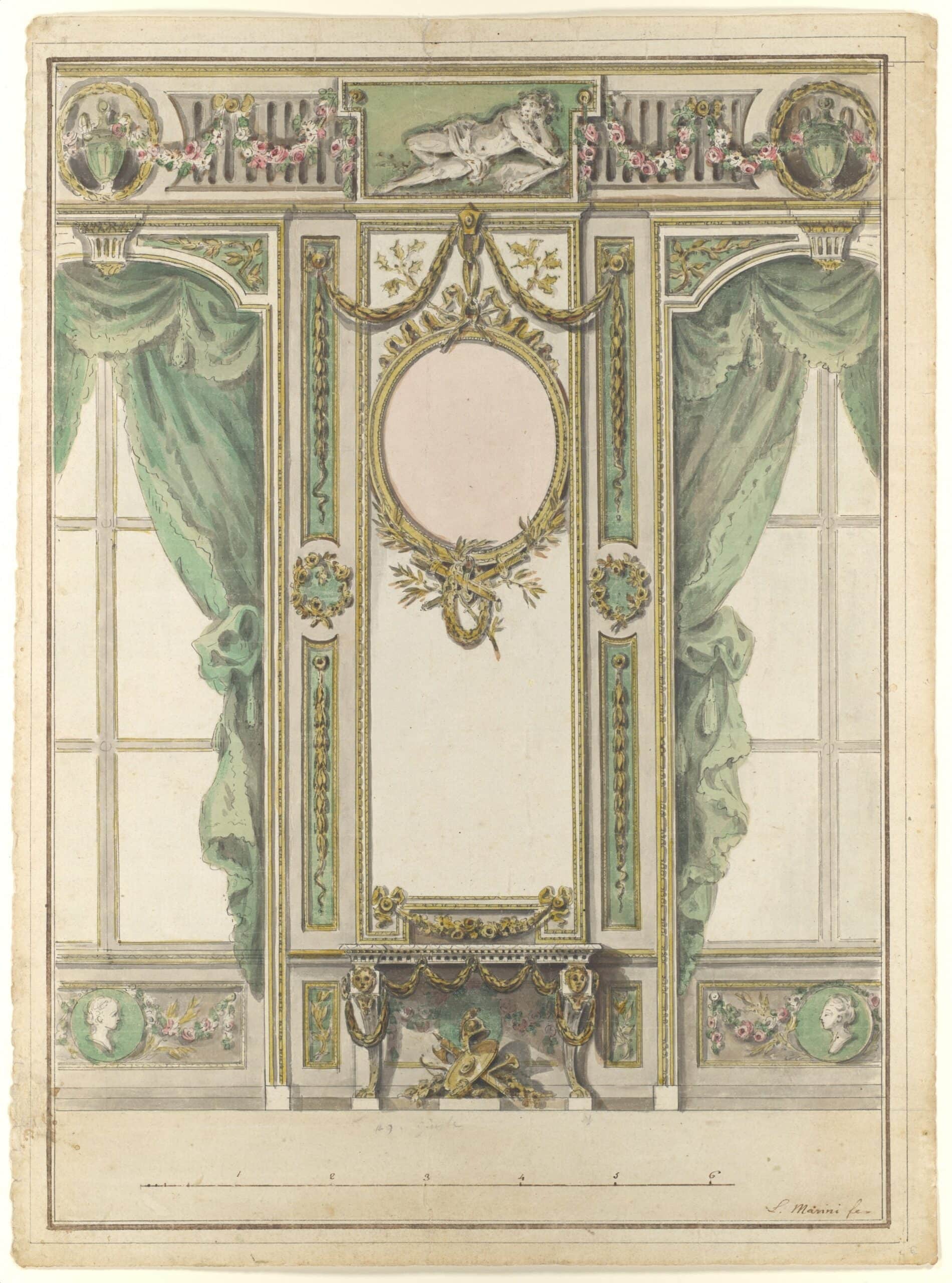 Here the colours are assigned to particular planes and elements of the architecture. They do not act as additions placed within a finished interior, but co-create its divisions. Leonardo Marini, Design for the Interior of a Gallery of a Palace. The Metropolitan Museum of Art, public domain.
The ceiling closes the composition
The ceiling occupies one of the largest surfaces in a room, and yet it often stays outside the colour scheme. Once the walls and joinery are settled, it receives white paint, as though it were a technical conclusion to the interior rather than a part of its architecture. A white ceiling can be superb. It reflects light, increases the contrast with coloured walls and clearly closes the upper boundary of the room. One has to remember, though, that it is precisely that boundary it emphasises. If the wall is dark or saturated, a pure white ceiling makes a decisive line running round the whole room. It may thereby bring out the height and the geometry. It may also make the ceiling look like a separate plane stuck on from above. Carrying the wall colour onto the ceiling works differently. The corner becomes less legible, and the interior more enveloping. The colour does not end at a notional height but takes in the whole volume. In a small room this can bring a sense of coherence; in a tall one, it can rein in the impression of empty space hung above the real interior.
One should not, meanwhile, repeat the simple formula by which a dark ceiling always lowers a room optically. If the contrast at the corner is strong, the ceiling may indeed seem nearer. But when walls and ceiling make a deep, tonally close whole, the boundaries can become less obvious, and the upper surface come to resemble a distant, dark vault. Height, proportion, the amount of light, the width of the cornice and the way the ceiling is lit all matter. The same navy in a low room with a sharp white skirting will act quite differently than in a tall interior in which wall, cornice and ceiling make a continuous surface. The possibilities do not end at the choice between white and the wall colour. The ceiling may take a lighter or darker tone, a shade drawn from the wallpaper, separate fields of colour, or a colour tied to the joinery.
Robert Adam and his contemporaries treated ceilings as compositions in their own right. Coloured fields, ornaments and stronger details were not, however, applied according to one universal palette.[16] Their arrangement answered the geometry of the ceiling, the rank of the room and the whole of the furnishings. The most important lesson, then, is not to copy the pink or green fields of a particular interior. It is to restore to the ceiling its due place in the design.
Sheen plays a similar role. A wall, cornice and joinery painted in one colour need not merge into a shapeless surface. Deep matt on plaster scatters light, semi-matt on wood draws out the edges, and a more glossy detail reacts to movement and to shifting reflections. Colour, then, can bind elements together, while material and light still allow them to be told apart.
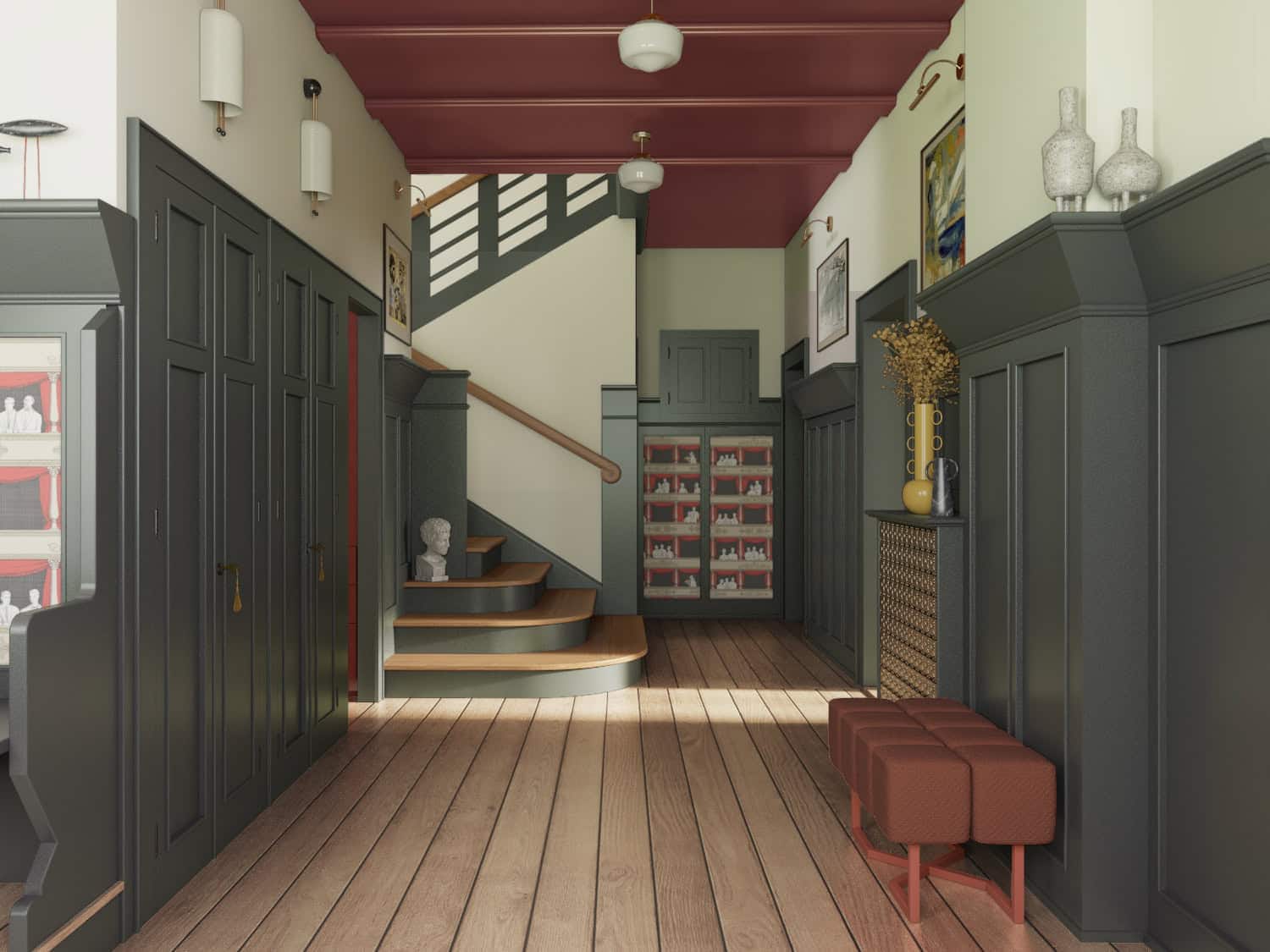 The colour of the ceiling here is not an addition to the walls: it balances the dark joinery and closes the composition of the interior. Design: Szawrot Design.
The house is seen in movement
A plan divides a flat into rooms. A person, though, experiences it as a sequence of views. Before we enter the drawing room, we see a fragment of it from the hall. Passing through a door, we take in the thickness of the reveal, the colour of the adjoining wall and the surface that closes the perspective. A mirror can bring into a room a colour that lies off the direct axis, and an open door can set side by side interiors that on the drawing board we studied separately. This is why a well-designed room does not always make a good sequence for the whole house.
Imagine a light drawing room seen through a darker hall. The hall can act as a frame: it strengthens the light of the further interior and leads the eye towards it. If both rooms are given an equally light palette, the passage becomes calmer, but loses part of its drama. A stronger wall at the end of a long axis can draw and order movement. The same wall placed at random to one side will be only one of several competing fields. Dark doors recurring in a row create a rhythm; a single dark leaf with no relation to the rest of the joinery can look like a foreign object.
 The maroon joinery underlines the passage and frames the view towards the dining room. The colour orders the axis between the rooms without closing off their mutual relation. Design: Szawrot Design.
It matters, too, on which side of the threshold the colour ends. The reveal may belong to the room, to the corridor, or make a frame of its own. Each of these variants sets the relation between the rooms differently. If the colour of the drawing room runs deep into the reveal, it can optically come to meet a person approaching from the hall. If the reveal stays in the colour of the circulation, the room begins only beyond the line of the door. A dark frame, in turn, can emphasise the very moment of passage. These are small surfaces, but it is precisely on them that one often sees whether the palette was designed as a whole or merely divided between the rooms.
A house needs quieter places too. If from every passage one sees an intense colour, a wallpaper, a patterned stone and a strong built-in, the successive interiors begin to compete. A corridor, a small hall or a room with a limited palette can act as a pause, thanks to which a more emphatic interior recovers its meaning. It is not enough, then, to ask whether a single room looks good. One has also to check what we see before entering, in the doorway, on turning round, and on the way to the next interior.
Modernism did not renounce colour
The image of modernism as a world of white walls, glass and chrome is only part of the story. White did indeed matter enormously: it was associated with light, hygiene, novelty, the simplification of form and a break with the weight of historical decoration. But this did not mean giving up colour. In many modernist interiors colour was not an ornament added to a neutral architecture. It helped to organise it. It could distinguish planes, shift the optical position of a wall, underline a direction or set apart a function without raising another partition. A darker surface seemed steadier and heavier; a light one could recede or reflect light. A strong colour placed at the end of an axis led the eye, and a coloured wall set crosswise marked the edge of a zone.
That the movement was “white” at all is, to a large degree, an effect of hindsight. As Mark Wigley has argued, the familiar picture of modern architecture as white turns out to be the work of a historiographical tradition that laboured to suppress the colour of the surfaces it described — and the white wall was itself never simply an absence, but a deliberately fashioned surface.[17] The denial of colour as a means of shaping space, one scholar of the period notes, has been among the chief misunderstandings of early modernism — the more astonishing in that its leading figures, from the Bauhaus through de Stijl to Le Corbusier, agreed on precisely the opposite: that colour was an inherent means of designing space.[18]
Bruno Taut is the clearest case. At the Gartenstadt Falkenberg near Berlin — the “paint-box estate”, as the locals christened it — he gave a housing development, probably for the first time, a strongly differentiated exterior polychromy: every dwelling distinguished by colour, so that the repetition of coloured sequences produced a vivid rhythm and broke the monotony of identical terraces, while recurring colours bound the whole together as one settlement. [19] Colour here did the work of architecture, not of decoration. And Taut understood it as inseparable from light: in his own house at Berlin-Dahlewitz he set the bright red of the living-room ceiling in the part that stayed in shade through the day, balancing it against the green of the grass outside, and never exposed his strong colours to direct sun, keeping them for the shaded and side-lit surfaces. “Colour is light,” he wrote.
Le Corbusier developed the same thinking in his polychromie architecturale. Colour served him, among other things, to differentiate planes, correct proportions and build relations between the elements of a space; and its choice was governed by the position of a wall relative to the light — a light blue on a curved wall held in half-shade, a yellow-ochre on a wall where daylight would strike and make it glow. His first Salubra collection, with its “keyboards” of colour, appeared in 1931, the second in 1959. [20] These were not a random catalogue of attractive shades. The keyboards limited the choice and allowed prepared combinations to be weighed against walls, curtains, carpets and furniture. The limitation had a creative meaning. It guarded against treating each element on its own and helped to build a coherent relation between several surfaces. Salubra was also a concrete finishing material — an industrially produced wall-covering that Le Corbusier compared to oil paint sold by the roll. Colour proves, once again, inseparable from technology, from the manner of execution and from the surface on which it appears.
For Le Corbusier, white itself was never the absence of a decision. The interior of a house, he held, has to be white — and to make that white perceptible, it has to face a regulated polychromy. White, in other words, was one deliberately chosen note among others, legible only in relation to colour; not silence, but a chosen tone of voice.
The most complete built statement of this idea is the Rietveld Schröder House in Utrecht, of 1924 — the one full architectural realisation of De Stijl. Gerrit Rietveld, working closely with its owner Truus Schröder-Schräder, used a palette limited to the primaries with black, white and grey, applied to independent horizontal and vertical planes so that colour did the work of separating and articulating space: walls, furniture and structural elements became, through colour, an integrated part of the architecture.[21] There is a telling detail: the colour of the floor was to be settled in relation to every other surface in the house, and had still not been resolved when Schröder moved in at the end of 1924. Colour, even here, at the movement’s purest, was decided in relation — never alone.
Historic interiors and modernism may seem distant traditions, but in both cases the most interesting questions are alike. Which plane is to be brought forward? What should recede? Which elements should be seen as a whole? How is colour to lead the eye and work with light? The language of forms and the technology differ. The basic role of colour, as a tool for building space, does not change.
First the task, then the shade
Colour need not carry a symbolic meaning assigned to it by a simplified psychology of colour in order to affect the character of a room strongly. A deep red does not automatically make a room ceremonial. Blue in itself does not guarantee calm, and green does not turn every interior into a place of rest. Meaning arises in relation to the surface, the light, the material and the other rooms. The same dark colour can look ceremonial on glossy, moulded panelling and intimate on the matt walls of a library. A light palette will be airy in a room with delicate joinery and plenty of light, but severe in a space stripped of textures and warm materials.
Before we begin comparing shades, then, it is worth establishing what task the colour is to perform. Should it: join a wall to a built-in, quiet an excess of divisions, underline the rhythm of the doors, bring out panelling or plasterwork, weaken the boundary of the ceiling, lead the eye towards a further room, make a frame for a picture or a collection, distinguish a historic element from a contemporary one, build a pause between more intense interiors?
Two colours of very similar shade can lead to different results if one is on a large matt wall and the other on glossy joinery. The same colour can also perform different tasks depending on its place. This is why the question “do I like this green?” is not enough. Others are needed: Why is it to be on this particular surface? What, after its application, will become more visible, and what less? How will it affect the next room?
A well-executed coating will not repair a haphazard spatial decision. One can bring a boundary out perfectly, paint every profile precisely and use the right product, and still make an interior over-divided or without hierarchy. First one has to design the relations. Only then choose the exact shade and the technology. The best effect does not always provoke the thought “what a beautiful colour”. More often it makes the architecture seem obvious, the proportions calmer, and the successive interiors join into a convincing whole.
The most important points
- Before choosing paint, establish which elements are to be read as one whole.
- Do not treat white joinery or a white ceiling as neutral solutions.
- Set the boundaries of colour in accordance with the architecture or a clearly defined composition.
- Do not underline every profile merely because it exists.
- Decide which room the reveals belong to and how the colour behaves in the doorway.
- Check the main lines of sight, including through open doors and in mirror reflections.
- Take the ceiling, the cornices and the sheen into account from the very start of designing the palette.
- Ask above all what the colour is to do with the space — and only later what exact shade it should have.
5. Light, surroundings and the variability of colour
The same wall can look cool grey in the morning, almost white at noon, and in the evening reveal a tone of green that was hard to find in it before. Once the lamps are lit, the green weakens, the beige turns more golden, and the navy moves towards black. We say then that the light has changed the colour. It is a convenient shorthand, but something more important hides behind it: colour has no single, unchanging form that waits for a sufficiently “neutral” illumination in order to appear undistorted.
A surface absorbs part of the light that falls on it and reflects part. It is that reflected light which reaches our eyes. When its intensity, direction and composition change, so does the appearance of the surface — even though pigment and paint remain the same. Light, then, is not an external addition that lets us see a colour already finished. It takes part in its making.
Daylight depends on more than the compass
The terms “north room” and “south room” are useful, but they turn easily into over-simple prescriptions. The direction the windows face is only one of many factors affecting the amount and character of the light. Others matter too: the size and proportion of the windows, the depth of the room, the height of the storey, balconies, loggias and eaves, the width of the street or courtyard, neighbouring buildings, trees, the kind of glazing, the season and the weather.
A room with north windows may be coolly and evenly lit, but need not be dark. Large windows high up will often give it more light than a small south window shaded by a balcony, the crowns of trees or a neighbouring wing. In an apartment building, more important than the north arrow on the plan may be whether the window gives onto a wide street, a bright courtyard, the brick wall of an outbuilding, or a plastered façade a few metres away.
The compass point is information. It is not yet a diagnosis of the interior. Nor is it only the light of the sky that enters a room. A large part reaches it after reflection from surfaces outside. Red brick can bring in a warm reflex. The green of trees can cast a faint glow on light walls. A pale building opposite can act as an enormous reflector, and snow increase the quantity of light so markedly that a winter interior looks different than in overcast autumn.
The view from the window is part of the palette too. The green of a garden, red roof tiles, the blue of the sky or the façade of the neighbouring building occupy a considerable part of the field of vision. Formally they lie outside the room, but optically they take part in its composition.
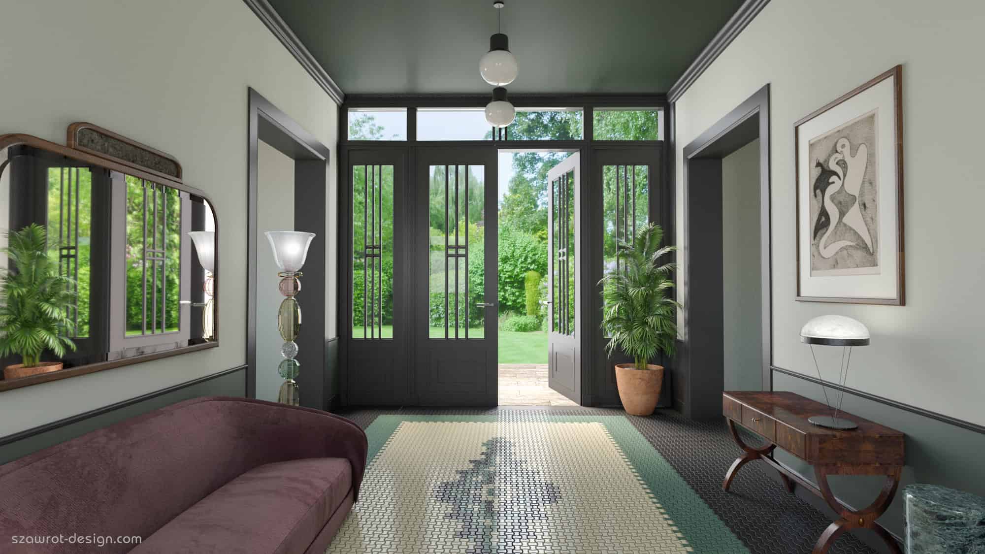 The colour of an interior does not end at the glass. The green of the garden, the daylight, the joinery and the coloured ceiling are received as a single arrangement. Design: Szawrot Design.
Just as important is the difference between direct and diffuse light. An overcast sky, or a window facing a shaded courtyard, gives a gentle light that fills the interior without sharp boundaries. Matt walls can look calm in it, and small differences of shade become easier to compare. Direct sun, by contrast, makes bright fields, deep shadows and clear contrasts. Falling from the side, it reveals the texture of the plaster, the marks of the roller, the places of repair and the unevennesses. On semi-matt joinery it draws out the profiles, the panels and the edges. The same paint, then, looks different on the wall facing the window, on the side wall, in the corner, in a recess and on the ceiling. This is not an unwanted instability to be removed entirely. It is thanks to the changes of light that we see the geometry of the room.
An over-simplification, too, is the rule by which cool light should automatically be balanced with a warm paint. Sometimes this gives a good result. Sometimes a warm beige reveals a pink tone in grey light, and a yellowish white begins to look grubby. A cool green may seem severe, but it may also make a superb ground for warm wood, brass and art. Not every interior has to be “repaired” with paint. Sometimes it is better to recognise the particular character of its light and work with it deliberately.
The eye is not objective
Colour changes not only because the light changes. The way our eyes and brain adapt to their surroundings changes too. Coming from a bright corridor into a dark library, at first we see mostly gloom. After a few minutes we begin to make out the transitions between deep greens, browns, the black of wood and fabric. The room has not grown lighter. What has changed is our ability to read the differences within it.
Adaptation to the colour of the light works similarly. In a room with very warm lighting we stop, after a time, attending to its yellow tone. A white sheet of paper still seems white, though moved into daylight the difference would be obvious. This affects the judging of samples too. After long looking at warm beiges, a more neutral shade begins to look cool. With several grey-green samples laid side by side, each brings out different tones in the others. The comparison grows more and more precise, but not necessarily more reliable. It is good, therefore, to: limit the number of samples, look at them separately as well, take breaks, come back to the interior after going outside, and judge the colour both immediately on entering and after a longer stay in the room.
The first impression matters, because that is how the room is read by a guest or resident coming in from a brighter part of the house. Adaptation matters just as much, because it tells how the interior will be received in everyday use. One need not choose between them. A good design takes both experiences into account.
Light is designed for living
Colours are most often approved during working hours: late morning or early afternoon. This is not always, however, the light most important for the room in question. A bedroom exists for its occupants above all in the morning and the evening. A dining room may be used chiefly after dark. A library will be seen under local lamps, and a kitchen, in the winter months, functions for a large part of the day under artificial light. There is no reason to expect every colour to look equally striking around the clock. First one has to set a hierarchy: when the interior is used, what is done in it and under what conditions it should work best.
The layout of light fittings on a plan does not yet describe the experience of a room. The light needed for work at a worktop, for reading, for looking at pictures, for dressing and for a quiet dinner has different tasks. A single central fitting can give general visibility and still leave the desk, the armchair or the table in an awkward place, without the light it needs. General light does not replace the light needed at a particular spot.
Information about colour temperature is not enough either. Two lamps both described as 2700 K can show green, red, wood and skin tones differently, because they differ in the distribution of the light they emit. Direction, intensity, the width of the beam, the height of the fitting and the surfaces from which the light reflects all matter too. One strong ceiling lamp can flatten an interior, lighting every surface evenly. Side light draws out texture and profiles. A table lamp makes a local zone of focus. Light directed at the ceiling increases the general brightness without sharp contrasts. Lighting a picture gives it greater weight and can change the hierarchy of a whole wall.
Warm light should not be a way of hiding a badly chosen paint. A yellowish filter laid over a whole interior will warm not only the walls but also the whites, the wood, the textiles, the pictures and the faces. It may turn an unwanted grey into a pleasanter beige, but it may just as easily strip the subtlety from blues and greens. Curtains, blinds and shutters belong to the design of light too. They do not only reduce its quantity. They change its direction, contrast and colour. A light fabric diffuses harsh sun, a dark curtain, once drawn, absorbs part of the reflected light, a pale one can act as a large reflector. Wooden slats bring in a warm tone, and a coloured fabric can throw a faint reflex on the wall. In the evening a curtain stops being a filter of light and becomes a large surface belonging to the palette of the room.
Historic interiors, too, were seen under conditions unlike ours. The light of candles, oil lamps and, later, gas was local, flickering and uneven. It made islands of brightness, deep shadows and restless reflections on gilding, mirror, glass, silk and polished wood. A many-coloured interior seen today under strong, even ceiling light may look more intense and more fussy than in the conditions in which it was made. This does not mean one should restore candlelight. It only reminds us that light was one of the materials of the old composition — like pigment, textile or sheen.
A good colour does not look the same all day
The aim is not to find a paint that keeps an identical form in the morning, at noon and in the evening. Such a demand would be both unreal and would strip an interior of part of its life. Some colours are interesting precisely because they change with the light. A green may seem cooler in the morning, more saturated in sun, and almost neutral in the evening. A deep blue shows its tone during the day and becomes, after dark, a dark ground for lamps, wood and pictures. One has, on the other hand, to recognise the limits of this variability. A colour that loses all its intended character during the most important hours of the room’s use does not become better merely because it looks lovely for twenty minutes of a sunny afternoon. This is why, in approving a palette, it is worth checking: how its lightest form looks; what becomes of it in shadow; whether direct sun does not make it too harsh; whether in the evening it keeps a recognisable tone; how it works with the lamps and the curtains; whether the most important materials remain legible.
This applies to dark colours too. A dark wall reflects less light, so the interior may indeed become darker. This does not, however, automatically mean it will seem smaller. Light surfaces show clearly the corners, the steps, the line of the ceiling and the boundaries of successive planes. A dark colour can weaken those boundaries, especially in the evening. The room is then sometimes less bright, but at the same time more focused, deeper, or harder to measure at a glance. Brightness and spaciousness are not the same thing. Rather than asking whether a dark colour will “take away the light”, it is better to establish: how much light is needed for the activities that take place there; where the reflecting surfaces should be; which elements are to stay distinct; what should be noticed first; whether the half-light is a fault or part of the room’s intended character.
Photographs can help to compare the scale of the changes, but they will not replace observation. A camera automatically corrects the exposure and the white balance, and a screen adds a further stage of interpretation. A photograph of a dark room may be lightened until it no longer resembles the real interior; another may exaggerate the warmth of the lamps. We are designing, then, not one ideal image of a colour, but the range of its appearances spread over time. A good decision does not consist in eliminating the variability, but in making sure that all its important forms are right for the interior.
The most important points
- Judge the real amount and direction of the light, not only the orientation of the windows.
- Take account of neighbouring façades, greenery and the view beyond the glass.
- Check surfaces in direct and in diffuse light.
- Establish at what times the room is most often used.
- Design light for activities and particular places, not only as a pattern of points on the ceiling.
- Judge paints under the intended, or as far as possible similar, light sources.
- Check the effect of curtains, blinds and shutters both by day and after dark.
- Treat the variability of colour as a property to be learned — not a fault to be entirely removed.
6. How to design a palette for a whole interior
A colour palette is often presented as a row of aesthetically arranged samples: a broken white, a beige, a green, a piece of wood, some stone and a touch of brass. Everything looks harmonious, until one has to decide which colour will take up tens of square metres of wall, which will appear on the doors, and which will be visible through an open passage from the adjoining room.
A set of matching samples is not yet a palette for an interior.
A palette begins to work only when each colour is given a place, a surface, a proportion, a material, a degree of sheen and a defined role in the composition. The same set of colours can make an interior calm or chaotic depending on which becomes the background, where the contrast appears and which surfaces are seen at once. It is not enough, then, to ask whether the colours go together. One has to establish what each of them is to do and how much space it should receive.
First, what cannot easily be changed
The first colour decision is often the choice of paint for the walls. Only later does one look for a floor, stone, wood and textiles to go with it. That order is convenient, but usually the reverse of the sensible. Paint offers an almost unlimited choice and can be changed relatively easily. Stone has a particular veining, parquet its own tone, and surviving joinery its history, texture and colour. A fabric of the right weave may exist in only a few variants. A picture, an old piece of furniture or the view from the window will not yield to correction because a beige chosen earlier has begun to look pink beside them.
It is easier to match paint to good stone than good stone to a hastily approved paint. The starting point should therefore be the elements that exist, or that were chosen for reasons more important than shade alone: floors, joinery, stone and ceramics, large furniture, valuable textiles, works of art, historic surfaces, the view from the windows, the character of the light. Not all the existing elements are attractive, and not all have to be kept. But their presence must first be acknowledged. An orange parquet, cream windows or a cool sill take part in the palette even when we try not to think about them.
A good palette begins with an inventory, not with inspiration.
Materials described as natural are, moreover, often treated as a neutral background. In reality wood, stone and metal bring very definite colours into an interior. Oak can be honey, pinkish, olive, greyish or smoky. White marble can have graphite, beige, greenish or violet veins. Brass changes with polishing and patina. Black metal, black lacquer and very dark wood are not the same black. These materials rarely make uniform fields. They introduce drawing, texture, sheen and natural variation. A small sample of stone may look calm, but once used on an island, a worktop and a wall it can become one of the main themes of the interior. A delicate veneer seen on a piece the size of a hand may make a very warm, dominant field once it covers a whole library of built-ins.
Scale belongs to the palette as strongly as shade. The same is true of white. If it appears on ceilings, walls, doors, ceramics and stone, it may occupy the largest surface in the house. It should not, then, be chosen last as “some warm white”. A cool ceiling can make cream joinery look yellowed. A neutral white wall beside warm stone can turn bluish. White ceramics, lacquer, fabric and marble are almost never identical. Nor do they have to be — but their difference should look intended.
Polished nickel, glass, lacquer, patinated brass and stone affect the palette not only by colour but by the way they reflect light. An interior with light walls, dark wood, greenish marble and warm-patinated metal may need no additional “accent colour” at all. The materials are already doing enough work. Before adding another colour, then, it is worth asking whether what is really missing is colour, or rather: contrast of lightness, texture, sheen, patina, a clearer drawing of the material.
Do not count colours — settle their roles
An interior does not need a set number of colours. It needs a legible order of importance. It can help to distinguish several roles, provided we do not turn them into an obligatory form. The background usually occupies a large surface and lets the other elements sound. It need not be light or neutral. A deep green covering the walls of a library can be as good a background as a broken white in a drawing room. The structural colour orders the recurring elements: the joinery, the doors, the built-ins, the dados or the circulation. It need not take the largest surface to set the rhythm of a whole interior. The dominant focuses attention or defines the character of a room. It is not always the most intense colour. A dark library covering a whole wall can dominate more strongly than a few bright objects. The accent appears on a smaller surface and is usually easier to change. It may be an armchair, a lamp, the interior of a display case or a small piece of fabric.
Not every project needs all these roles. Sometimes the background is at once the dominant, and the most important contrast arises between two materials, not between two paints. The categories are meant to help recognise a hierarchy, not to impose one way of composing. The popular 60–30–10 formula can be useful as an elementary exercise in proportion. It does not, however, know our room. It does not know whether it contains a timber ceiling, several pairs of doors, panelling, patterned stone, a huge window onto a garden, a picture taking up half a wall. It does not distinguish twenty per cent of quiet beige from twenty per cent of dense ornament. It takes no account of the position of a surface or of the way it reflects light. A small field of strong red at the end of a long axis can carry more weight than a much larger but quiet side surface.
More useful than counting percentages is the judging of visual weight. It is affected by: lightness, saturation, contrast, surface, repetition, a position facing the entrance, sheen, the drawing of the material, the importance of the architectural element itself. It is worth looking at a project almost as at a black-and-white image first. What is lightest? Where is the greatest contrast? Do all the large surfaces have a similar weight? Do the dark floor, built-ins and sofa not gather the whole composition at the bottom? Does the ceiling stay part of the interior, or become an accidental light plane? A simple greyscale collage can reveal more than another comparison of the names of shades.
Many of the problems put down to badly chosen colours arise in reality from a wrong relationship of lightness. Two different shades can look calm if they have a similar value. Two close beiges will stand sharply apart if one is clearly lighter. Saturation, likewise, needs the right place. Not every colour has to be smoky, earthy and ambiguous. An interior made up solely of carefully muted colours can be as monotonous as a wholly white flat. A cleaner colour may be needed, but its action depends on the surface and the surroundings. An intense blue on all the walls is one thing; the same blue inside a display case another. A strong colour on the ceiling acts differently than on an armchair. If several large surfaces are to compete in intensity, perhaps one of them should be quietened. If the whole is very safe, it is worth checking whether that follows from the concept or merely from a fear of deciding.
The starting point of a palette may be a picture, a carpet, a wallpaper, a stone or a historic floor. One need not, however, mechanically extract from it every colour present. A stone containing green, pink, beige and white does not require each of these tones to be repeated on a separate surface. Such literal matching can turn a whole interior into an illustration of a sample. The starting element should set the project going, not subordinate everything to itself. Sometimes more important than a particular colour is its contrast with the background, the relation of light and dark fields, or the way the material joins several tones.
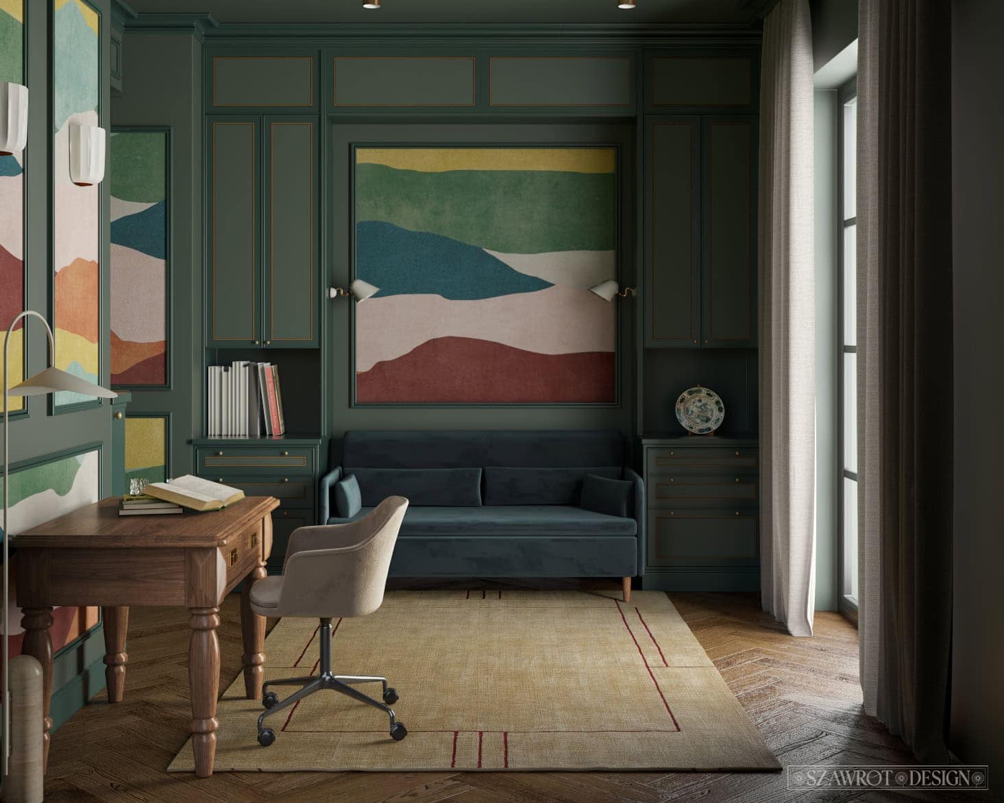 A deep green makes the background and the structure of the interior, while the multi-coloured panels remain a local dominant. The coherence follows from the hierarchy of surfaces, not from limiting the palette to one or two colours. Design: Szawrot Design.
Coherence does not consist in repetition
The palette of a whole house needs continuity, but this does not mean that one colour should appear in every room. The common elements may be made by: floors, window and door joinery, the metal of the fittings, a recurring kind of wood, a stone used in several places, a similar tone of the ceilings, the colour of the circulation, a consistent treatment of skirtings and reveals. The isolated elements give particular interiors their own character. This may be a wallpaper in the bedroom, the deep colour of a library, the colour of the dining-room ceiling, a special fabric or a decorative stone in the bathroom. The proportion between them depends on the layout of the house. In an open space we need more common elements, because several zones are seen at once. In an enfilade one can allow clearer differences, taking care over what appears in the successive frames of the doors. In a house with rooms that close, each interior can receive a stronger, more separate palette.
Coherence does not mean uniformity. It means that the changes have a recognisable logic. Different kinds of repetition help. Literal repetition consists in using the same colour or material in several places: one joinery, a common floor, the same stone. Tonal repetition joins colours of similar lightness, saturation or way of being muted. The shades may differ and yet belong to one quiet family.
Repetition of relationship is less obvious. We repeat not the product but the way of using it: darker joinery against lighter walls, a coloured ceiling in selected rooms, a quiet circulation between more emphatic interiors. This last method often gives the most mature effect. The house keeps a common syntax, though it does not everywhere use the same words.
The idea of a coordinated colour system — a restricted family of compatible colours rather than an unlimited catalogue — has a real pedigree. It runs through the standardised colour ranges that grew up alongside industrial paint production; Patrick Baty traces this line of colour standards from the early nineteenth century down to the British Standard range of 1972. And it found a designer’s form in Le Corbusier’s Salubra keyboards, mentioned earlier: a deliberately limited set, arranged so that products and surfaces could be combined without accidental clashes. An unlimited catalogue does not always make designing easier. Often it multiplies decisions that add nothing essential. A well-constructed family of materials can give the user more real freedom, because it reduces the number of chance collisions while leaving room to make different combinations.
No system, however, controls the whole life of a house. An interior will be filled with books, toys, pictures, flowers, keepsakes, inherited things and objects bought later. The coloured spines of books, ceramics, things brought back from travels and everyday objects will not be matched to a material board. A real interior comes into being over time, at the crossing of a design and the biography of its inhabitants. A palette should have a clear enough structure not to fall apart at the first object from outside the catalogue. This does not mean it has to be neutral. A deep wall colour can order varied pictures, books and furniture better than a weak, accidentally light background. A house will not, for its whole life, look like a design board. A good palette should be able to accept that.
The palette reveals itself between rooms
Designing the palette of a whole house does not consist only in matching a few sets to the individual rooms. The plan shows their boundaries. The eye does not respect those boundaries. From the hall we see the wall of the drawing room. From the drawing room — a fragment of the kitchen, the corridor or the library. A mirror can reflect a colour lying off the direct axis. Through a tall opening one sees a fragment of the ceiling of the next room. A reveal belongs formally to one room but stays in the field of vision of both. This is why, on the plan, it is worth marking: the main lines of sight, the walls that close the perspectives, the rooms seen at once, the reflections in mirrors, the meeting-points of floors, the colours of the reveals, the surfaces visible from several rooms.
It is no longer a question only of whether two colours go together. One has to see in what proportion and from what distance they will be seen. A strong wall at the end of an axis can draw the eye and indicate a direction. The same colour placed on a short side surface will have a quite different weight. A light interior seen beyond a darker passage may seem more open. Two very good colours, on the other hand, can look bad if they meet in the narrow frame of a door and have almost the same lightness but a different tone.
A corridor, too, need not play the part of a neutral truce between the “proper” rooms. It may be: a quiet background, a darker frame for lighter interiors, a place to repeat the colour of the joinery, a space that leads to a dominant, an interior in its own right with its own palette. In a narrow, under-lit hall, white does not always bring the expected brightness. Without good light it can look grey and flat. A deeper colour will not increase the amount of light, but it can give the conditions a deliberate character and make a contrast with the further rooms. It does not follow that every dark corridor should be painted dark. The point is to abandon the automatism and treat the circulation as part of the whole sequence.
In the chapter on architecture, colour served to build passages and perspectives. Here it becomes a tool for working on the palette: we check not only the individual rooms, but all their shared views.
From concept to the decision on site
There is no single tool that lets one foresee all these dependencies. A plan helps to understand the arrangement of colours and materials, elevations of the walls show their proportions and meeting-points, and visualisations allow one to judge larger fields, contrasts and views between rooms. A trial made on the intended ground answers, in turn, the questions a screen cannot settle: how the surface of the paint looks, what sheen it has, how it reacts to the texture of the wall and to real light.
A visualisation, then, will not replace a colour trial, just as a small sample will not yet show the weight of a dozen square metres of painted surface. A screen emits light, while a wall reflects it. A digital image also shows only one chosen moment: a particular time of day, direction of light and point of view. It shows the composition well, but is not suited to approving a subtle difference between two whites or the final depth of a dark paint.
One has to remember future proportions too. A light paint covering most of a room, a wooden built-in taking up a whole wall and the intense colour of a small armchair are not three equal components. They may look like a harmonious set of small samples, but in the space each of these surfaces will take on a quite different weight.
It is worth beginning the work by recognising the permanent elements and the way the rooms are used. Only on that basis can one set the hierarchy of light and dark fields, choose the elements common to the whole house and decide which rooms should take on a more local character. Then each colour has to be assigned to a particular surface: not just to “the drawing room” or “the bedroom”, but to the walls, the ceiling, the joinery, the built-ins, the reveals or the interior of a display case. Together with the colour one must define the material and the degree of sheen, because the same shade on plaster, wood and metal will not make an identical surface.
Trials may reveal that what needs correcting is not the chosen colour itself, but the neighbouring white, the tone of the wood, the kind of light or the proportion between the surfaces. This is why, after checking the individual samples, one has to look again at the whole arrangement, rather than correcting each decision in isolation from the rest.
The last stage is the exact description of the solutions for execution. The name of the colour alone will not do. The documentation should give the maker, the product line, the code, the sheen, the ground, the kind of primer and the exact extent of use. Particular attention is needed for the reveals, recesses, lintels, dados, built-ins and the meeting-points of walls and ceiling. A subtle concept can be destroyed despite correct painting, if the right colour ends up on the wrong side of a passage.
A palette is ready not when each sample looks good on its own, but when it is known which surfaces make the background, where the greatest weight lies, how the successive rooms join, and exactly where each material and colour ends. A good test is to imagine the interior without cushions, vases and carefully arranged trifles. If without them the whole composition falls apart, the additions were probably not completing the palette, but trying to save it.
The most important points
- Begin with the permanent elements and the real materials.
- Treat wood, stone, metal, textiles and the view from the window as full members of the palette.
- First set the hierarchy of lightness and visual weight, and only then the exact shades.
- Assign to each colour a particular surface and task.
- Separate the common elements from the local ones.
- Analyse the views through doors, the reflections and the meeting-points of rooms.
- Take account of material, texture and sheen, not only the colour code.
- Check proportions on the plan and elevations, and the shade on real trials.
- Document the decisions with the precision of a working drawing.
- Leave quieter places, so that the stronger moments can keep their meaning.
The palette of a whole interior is not a collection of colours that look good side by side on a table.
It is a system spread through space: from the largest wall to the narrow reveal, from the light at the entrance to the darker room at the end of the perspective. It works when it has hierarchy, rhythm and enough freedom to accept the real life of the house.
7. Colour uncovered during renovation — what old layers really say
While stripping wallpaper or cleaning old joinery, a narrow band of green appears. Beneath it, cream; deeper still, blue. Someone takes a photograph and says with conviction: “This is the original colour.” Possibly. It may equally be a primer, a short-lived repaint, the remains of a decoration covering only part of the wall, or a coating whose ingredients have changed colour.
A find may be very valuable, but it does not by itself settle how the old interior looked. A wall is a kind of archive — incomplete, damaged and edited many times over by successive renovations. The discovery of a colour does not end the investigation. It only begins it.
There is a name for this investigation: architectural paint research. In Britain it is associated above all with Patrick Baty, who for decades has analysed the paint of historic buildings — from Historic Royal Palaces to private houses — and whose book The Anatomy of Colour sets out the field.[22] Its first principle is exactly the one that matters here: a single scraping is a clue, not a verdict.
An old layer is a trace, not an answer
Successive renovations leave grounds, primers, finishing paints, glazes, varnishes, wallpaper pastes, dirt, repairs and later repaints. Their order and mutual relations are called stratigraphy. In a cross-section seen under magnification the arrangement can resemble a geological profile: substrate, ground, several thin coloured layers, a band of dirt, the next finish and the modern paint.[23]
A cross-section shows above all the order in which the layers were applied. It does not automatically say which of them was meant to be seen, whether it covered the whole room, how long it stayed visible, or how it looked before ageing.
The lowest layer found need not be a finish. Wood may have been sized, filled and primed before graining, varnishing or the application of an opaque paint. Plaster received a whitewash or a coat to even out its absorbency. A light band lying directly on the wood does not, then, prove that the door was white, just as a red ground under a dark coating does not mean red joinery.
Recognising the function of a layer requires comparing its thickness, texture, transparency, pigments and binder with other fragments. The overlaps of one paint onto another matter too, because they can reveal the order in which the walls, joinery, cornices and other elements were painted.
An exposure — the controlled uncovering of successive layers — also has its limits. A very thin coating may be removed together with the next. A transparent glaze will stay almost invisible, and two close whites will merge to the eye. A wrongly chosen chemical agent may dissolve an earlier paint, change its sheen or damage its binder.
It is especially easy to end the search too soon when the uncovered colour answers our idea of the old interior. An elegant green, a deep blue or a warm “historic” white seem at once more convincing than an unremarkable grey primer. But the attractiveness of a find is not proof of its function or its date.
One sample, moreover, describes the history of one place. By the door the paint was touched and knocked; the lower part of the walls was rubbed during cleaning; near the window a stronger light acted; behind a wardrobe there was darkness; by the fireplace soot and heat gathered. This is why one examines various fragments of the walls, the joinery, the ceilings, the cornices, the dados, the recesses and the places sheltered by later elements.
The absence of a layer at one point does not prove it was never there. Distempers were soluble in water and were often washed off before the next painting or papering. [24] Old coatings perished during plaster repairs, the replacement of services, the moving of skirtings, the drying-out of walls, sanding and the changing of joinery. After a whole decorative phase there may remain only a narrow trace on the edge of a frame.
A wall does not keep its history evenly.
An exposure can reveal not only an earlier colour or ornament but a whole erased arrangement and the former function of an interior. In one tenement stairwell, beneath later coats, fragments of painted decoration are being uncovered; the original scheme included figures of lions, one of which stayed hidden for decades behind a secondary wall after part of the reception hall had been partitioned off. Its re-exposure shows that a renovation can restore legibility not to a single layer but to a whole composition erased by time. Photo ESW
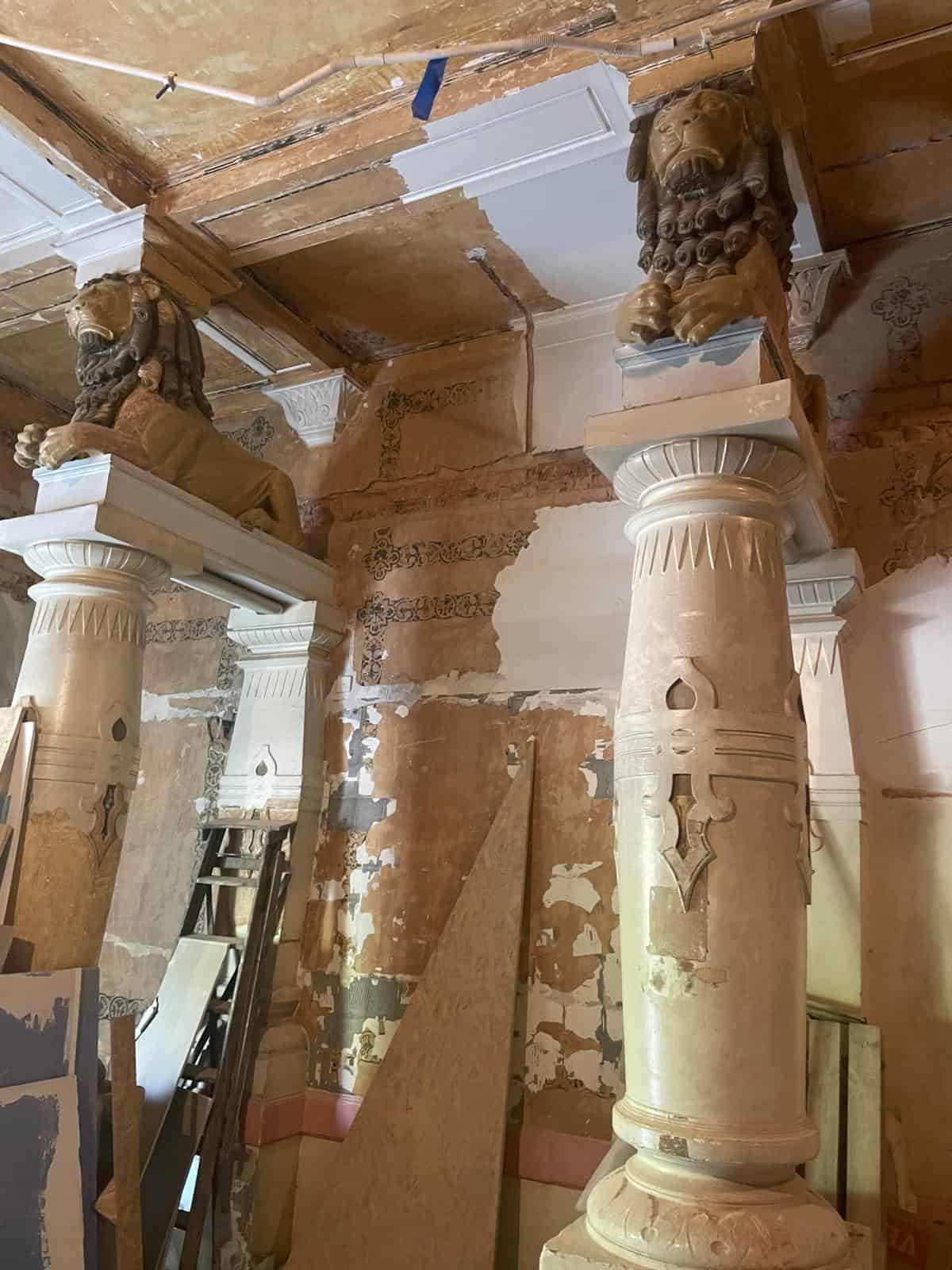
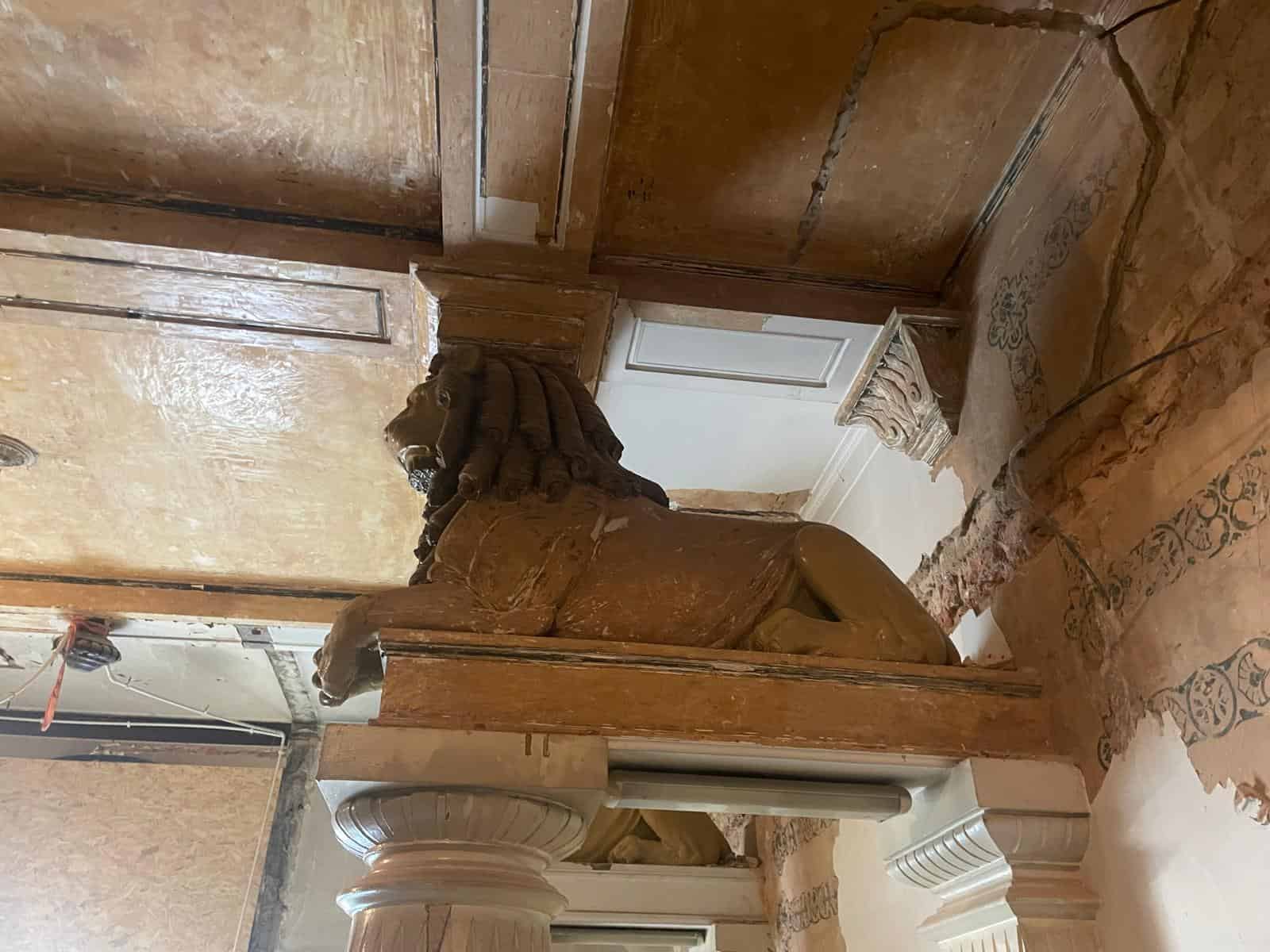
What we see today need not be the old colour
An uncovered coating is authentic historical matter, but its present look need not correspond to what was seen when the work was finished.
Pigments and binders age in various ways. They can fade, darken, yellow, chalk, lose sheen, change transparency or react with moisture and the ground. Some pigments, Prussian blue among them, are susceptible to changes caused by the chemical conditions of their surroundings.[25] Recognising the pigment can help to determine the probable direction of change, but it will not always allow the exact original shade to be reconstructed.
Even a fragment sheltered by a picture or a wardrobe is not automatically a perfect model. It may have been protected from light, touch and dirt, and at the same time have yellowed more in the dark, if it was executed in an oil technique. An exposed fragment, in turn, may have faded but kept a different degree of sheen. Both places carry information, but neither need present the whole truth.
An exact measurement does not remove this uncertainty. A spectrophotometer can describe the colour of a surviving fragment, and a modern mixing system prepare a paint of similar parameters. We are measuring, however, the surface in its present state: after the processes of ageing, on a particular ground, with the current texture and degree of sheen.
A new paint will have a different binder, grain, covering power and way of reflecting light. Even a very precisely matched colour will not automatically restore the old surface.
In research on the reconstruction of historic coatings, attention is paid not only to the pigments and the recipe, but also to the way the paint was prepared, the pigment ground and the brush handled.[26] A perfectly smooth layer made with a modern roller may be technically excellent and at the same time less like a historic finish than a subtly uneven surface.
A sound research result does not always end with a number from a paint catalogue. Sometimes the most honest conclusion is to define the family of the colour, the technique and the relationships between surfaces, without pretending that we know the shade to the precision of a modern code.
“Original” — but from which moment?
In a building rebuilt many times, the word “original” quickly loses its obviousness. Is the original the first paint applied after the house was built? A decoration made a few years later by an important designer? The best-preserved valuable phase? Or the last historic repaint before the present renovation? Each of these answers can be justified, because authenticity always refers to a particular time and stage in the history of an object.
This is not a private difficulty of one trade; it is the central problem of modern conservation doctrine. The Venice Charter of 1964, the founding document of the field, treats the reconstruction of what has been lost with great reserve, admitting in principle only the reassembly of surviving original elements. The Nara Document on Authenticity of 1994 went further, and made authenticity a relative matter: since the values attributed to heritage, and the credibility of the sources that inform us of them, may differ from culture to culture, authenticity cannot be judged by fixed, universal criteria.[27] The oldest layer is not automatically the most important, and the phase judged most valuable is not always the one best suited to full reconstruction.
The nineteenth century supplies the classic warning. When Eugène Viollet-le-Duc restored Notre-Dame in Paris and the walls of Carcassonne, he did not so much uncover a past state as complete and idealise it — creating an image of the Gothic that owed as much to the restorer as to the Middle Ages. His interventions were long criticised as falsifications; today they are valued as an authentic layer in their own right, a document of how the nineteenth century imagined the past. “Which phase is the original?” has, here, no innocent answer.
That authenticity is bound up with a whole system, not a single colour, is shown well by the former sanatorium at Trzebiechów, where Henry van de Velde designed not only individual pieces of furniture but a whole scheme embracing the joinery, the ornament, the textiles, the lighting and the colour. Surviving correspondence indicates that the final colour decisions were to follow from setting the architecture against the furnishings.[28] Later repaints covered part of the concept. To understand it, it was not enough to find a greenish fragment on one set of doors. One had to join the study of the successive layers with the documents, the ornament, the function of the rooms and the relations between joinery, walls and furnishings. Only in such an arrangement do the individual colours recover their meaning.
A comparable caution is forced by the most thoroughly studied interiors. In one well-documented room, a single wall yielded twenty-seven technological layers, grouped into eleven chronological phases; only the joining of the exposures with material analysis, building archaeology and archival research allowed the earlier dating of the painted decoration to be corrected and a mistaken hypothesis about the room’s history to be rejected. A stack of layers is not a chronology until someone reads it.
A different problem is posed by post-war reconstruction. The coloured plasters, wall paintings and sgraffiti of many rebuilt historic centres are not, in whole, surviving old matter; they belong to reconstructions carried out after wartime destruction. And yet such a reconstruction can itself become a historical document and a value under protection — which is precisely why the Venice Charter’s reserve towards reconstruction meets, in these cases, its most debated exception. A layer made in the 1950s can therefore be authentic for the phase of rebuilding. A later coating is not, by definition, a needless film obscuring the “true” history. Sometimes it is itself the history, to be recognised and kept.
One has also to check whether the chosen colour phase answers the present architecture. If an old blue comes from a time when the room had different doors, a lower dado and a fabric on the upper part of the wall, laying it on today’s interior will not restore the old composition. It will make a new whole using one historical component. One frequent way of creating a historical fiction is to join the oldest wall colour, the best-preserved coating of the doors and the most decorative phase of the ceiling. Each element may be authentic, yet they need never have occurred together. Authentic components do not automatically make an authentic whole.
To expose, to conserve or to reconstruct?
The discovery of an earlier layer does not yet settle what should be done with it. Exposure, conservation and reconstruction are different actions, even if in everyday speech they are treated as one. Exposure consists in removing the later coatings to show an earlier one. It is not a neutral act. It irreversibly removes all the layers lying above, and may at the same time expose the uncovered surface to damage, light, touch and changes of humidity.
Conservation means securing the authentic matter. It need not involve its permanent display. A layer may be recognised, documented, secured and then covered with a solution chosen by the conservator. Invisibility need not mean loss. Reconstruction consists in making a new surface on the basis of research. One can reconstruct the arrangement of colours, the ornament, the texture, the sheen, the technique or the probable shade. A reconstructed surface remains, however, a new execution.
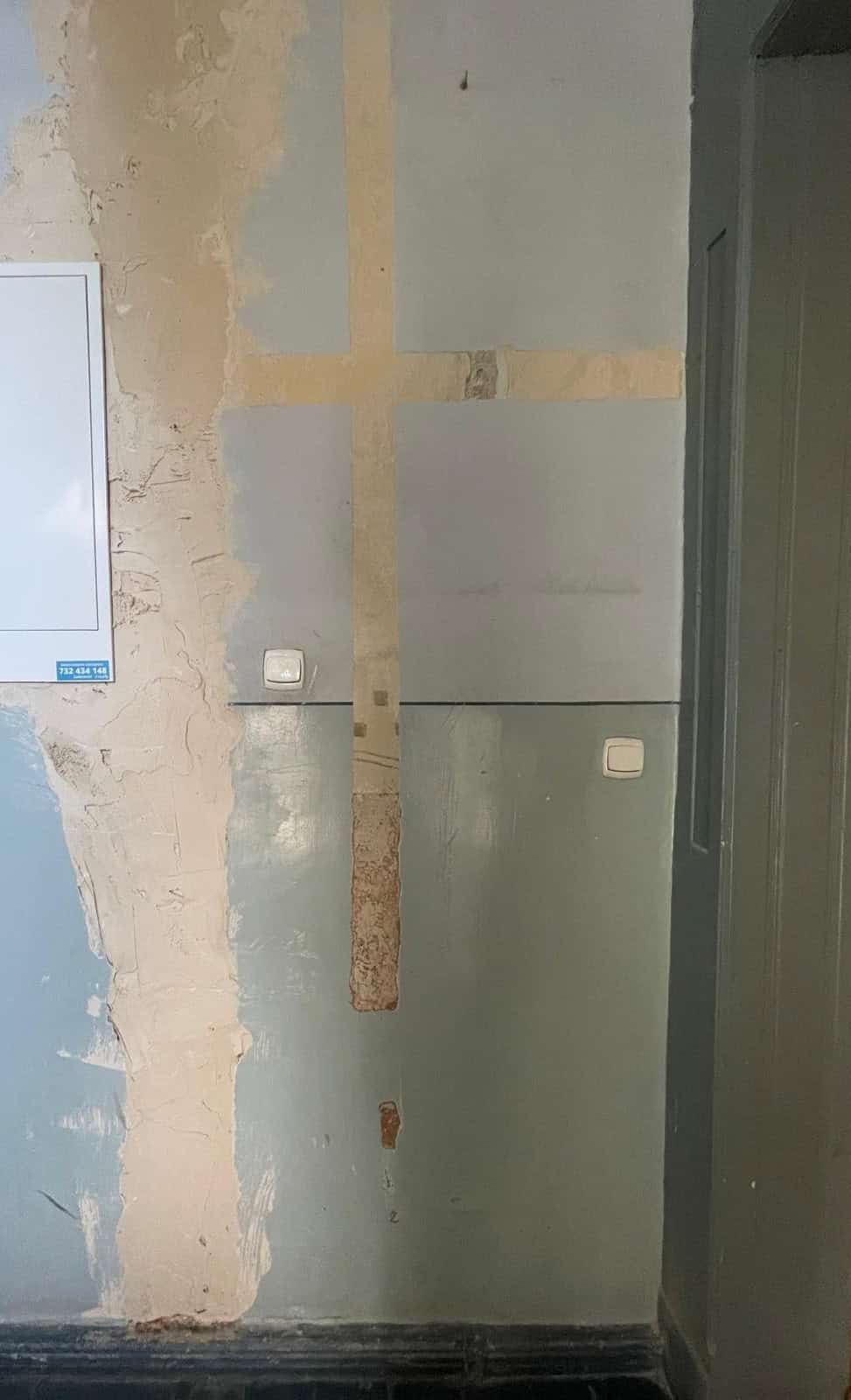 Exposures on the wall of a stairwell show the successive colour layers, the changes of division and the differences between matt and more glossy surfaces. A single fragment is not yet enough to reconstruct the whole composition. A tenement stairwell; photo ESW.
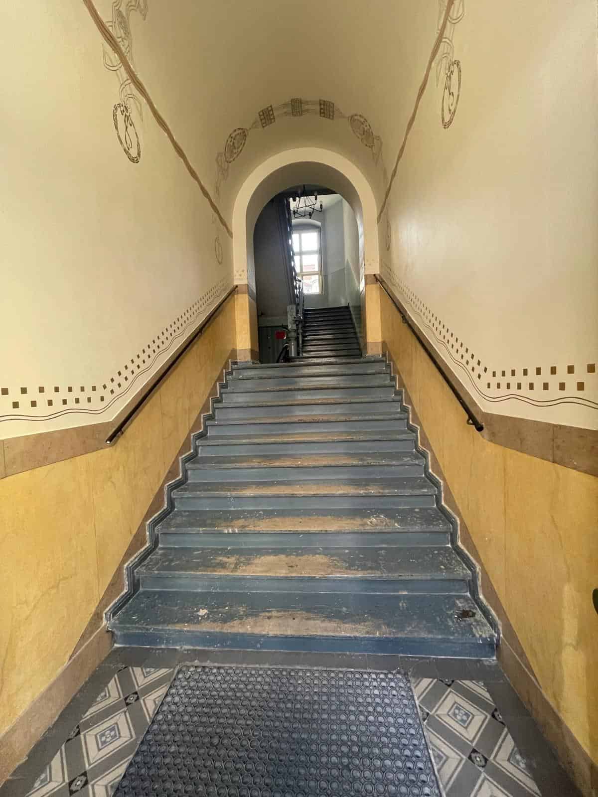 A reconstructed scheme of stairwell decoration: the ornamental motifs, borders and colour divisions have been remade on the basis of recognised traces. The reconstruction restores the logic of the old composition, but remains a new layer. The same tenement; photo ESW.
Naming these actions precisely does not lower their value. On the contrary — it allows one to distinguish honestly the preserved matter from the new addition, and not to create the impression that a reconstructed interior is materially the same interior that was seen two hundred years ago. Nor is leaving a visible exposure always the best way of telling the history of a building. A fragment secured and properly described can show a technique, an ornament or a sequence of phases. A random rectangle with ragged edges, left only because it looks picturesque, easily becomes a decoration stripped of legible meaning.
Before deciding, it is worth asking whether the exposure shows important and comprehensible information, whether it can be safely displayed, and whether the viewer will know what they are looking at. Sometimes fuller documentation, and leaving the historic layer beneath a later finish, is of greater value.
From find to decision
On noticing an earlier decoration, one should stop work in its immediate vicinity. One should not widen the exposure oneself with a sander, wash the surface, remove further coatings or apply a primer. First one has to photograph the whole wall and the detail, place a scale beside the find, record its exact position and note what tools and agents were used before the discovery. Particular attention should be paid to regular lines, stencilled ornaments, painted borders, graining, marbling, gilding, metallic fragments and decorations appearing above a later-lowered ceiling. Such traces may indicate that we are dealing not with a uniform repaint, but with part of a larger decorative system.
The next step is consultation with a conservator of the appropriate speciality. Only after recognising the technology, the state of preservation and the significance of the layer can one decide whether it should be studied further, secured, shown, covered again or used as the basis of a reconstruction. Research does not, moreover, oblige one to reconstruct the old interior. The result can be used more subtly: to restore the historic division of a wall, to repeat the relation of light and dark surfaces, to use a colour related to the one uncovered, or to recreate the difference between a state room and a private one. One can also keep a fragment of authentic matter and design the rest of the interior in a contemporary way.
Inspiration is not reconstruction. Reconstruction is not the original. Giving up reconstruction does not mean a lack of respect for history.
The most important points
- Do not assume the lowest visible layer was the final finish.
- Do not base an interpretation on one exposure or one fragment of a room.
- Remember that some old coatings may have been washed off, sanded away or removed during repairs.
- Take account of fading, yellowing, darkening, dirt and changes of sheen.
- Analyse the walls, joinery, ceilings, dados, cornices and ornament together.
- Set the results of material research against the documents and the history of the building’s rebuilding.
- Do not equate the oldest phase with the phase automatically most valuable or most suitable for reconstruction.
- Distinguish exposure, the conservation of authentic matter, and the making of a reconstruction.
- Document even those discoveries you do not intend to display or reconstruct
8. A good palette does not begin with the choice of paint
After looking at hundreds of samples, one may come to believe that the right answer is hiding somewhere between two broken whites. One will be a touch warmer, the second more mineral, the third will disappear on the wall exactly as it should. And yet most colour problems are not solved by the next sample.
If we do not know which elements of the architecture should be brought out, what tone the floor contributes, how the room looks in the evening and what we shall see through an open door, a more perfect shade will help little. Paint will not repair a haphazard hierarchy of surfaces, the wrong sheen, or a palette that ignores the materials already present in the interior. A good palette does not begin, then, with the question “what colour will suit here?”. It begins with recognising the place — its architecture, its light, its materials, its history and its way of being used.
The palette begins with the place
Colour can order architecture, make a background for art, join joinery to walls, differentiate rooms, bring out a material, mark a direction or build a particular atmosphere. Before we choose a shade, we have to establish which of these tasks are really needed. In one interior the most important thing will be to quiet a multitude of divisions and pieces of furniture. In another — to underline a high ceiling, make a clear frame for a picture or connect several rooms seen at once. Sometimes colour should take the initiative, and sometimes its role is to let the wood, the stone, the textiles or the surviving joinery sound.
The same phrase — “a calm interior”, say — can lead to very different decisions. Calm may follow from a small contrast, a limited number of materials, a repetitive rhythm of joinery or an enveloping, deep colour. It need not mean a light beige. Just as imprecise is the wish for an interior to be “timeless”. Every project arises in a particular culture, with the available technologies, materials and ways of living. Timelessness is not a colour or a style. It may, however, follow from a solution being well set into the architecture and not resting solely on a momentary effect. The most important question, then, is not “is this colour beautiful?” but “is it right precisely here, and what is it to serve?”.
A preference has to be translated into space
Personal preferences matter. There is no reason to persuade a person who loves deep greens that they should live in beige merely because beige passes for a safe solution. “I like blue”, however, does not yet say whether it is to cover all the walls, appear on the ceiling, the doors, a fabric or the interior of a display case. Nor does it define whether it should be light, clean, subdued, mineral or almost navy. A preference is a starting point; designing consists in translating it into scale, material and place. This applies to interiors called neutral too. White, beige, wood and stone do not mean the absence of a colour decision. One has to define whether the white is cool, cream, grey or limewash, whether the beige moves towards pink, yellow or olive, how warm the wood is and where the darkest surface lies. It matters, too, whether the metal is polished, brushed or patinated.
A neutral interior can be subtle and complex. It can also look like a set of elements that do not conflict only because they all speak equally quietly. Neutrality is a choice of tone of voice, not silence. A similar trap is the search for an “unobvious” colour. An ordinary green seems too simple, a white insufficiently authorial, so we begin to look for a shade that is at once a blue, a clay, a smoke and a sage. Such colours can be beautiful. But they are not, of their nature, more refined than a plain navy, red or yellow. Originality follows more often from the place of use, the proportion, the relation to the joinery, the pairing of rooms, the sheen and the behaviour in light than from an unusual name on a sample.
One does not have to invent a new colour. One has to use an existing one properly.
A simplified psychology of colour, likewise, will not replace a conversation with the inhabitants. Popular tables assign colours fixed properties: blue calms, red excites, green regenerates. But we do not react to an abstract blue — we react to a particular surface: light or dark, clean or muted, matt or glossy, enveloping a whole room or appearing on a single element. The reception of a colour depends too on the light, the materials, the scale, the function of the room, personal memories and habits. A dark library calms one person and drains another. A strong contrast can help orientation or quickly tire. Rather than asking what colour should provoke a given emotion, it is better to learn in what interiors the inhabitants really feel well, what level of brightness they need and whether intense combinations give them pleasure over a longer time too. Colour comfort is personal, cultural and spatial. It does not fit into a simple table.
History and fashion give no ready answer
Colours and the ways of using them are subject to fashion. There is no sense in pretending that designers work outside their time. Even a declaration of choosing only timeless solutions usually betrays quite clearly the era in which it was made. A trend can draw attention to possibilities passed over before: coloured ceilings, darker joinery, patterned stones or more intense combinations. The mere fact that a solution is fashionable does not make it wrong. The trouble begins when popularity replaces the analysis of the interior.
The mechanism repeats itself across the decades. A solution appears as fresh; then it is copied without understanding, loses its meaning, and returns years later as a recognisable sign of its time. The bold geometric patterns of the 1950s — the “contemporary” look of that mid-century moment — went the whole way round this circle: first a badge of modernity, then a mass-produced cliché derided as a new kind of kitsch, and at last a nostalgic emblem of a well-designed visual culture. Fashion does not disqualify a colour, but it cannot be its sole justification.
History, likewise, is not a storehouse of ready palettes. Old interiors can suggest dark doors, coloured ceilings, tinted cornices, glossy panelling, matt distempers, graining, marbling, gilding or monochrome arrangements. More than copying a particular shade, though, is given by the question why it was used precisely there. Did the choice follow from the function of the room, the price of the pigment, the kind of ground, the amount of light, the rank of the room, the relation to the textiles, or perhaps an attempt to imitate a costly material? Did the colour join surfaces or separate them? Was it a background, an ornament, or part of an architectural order?
One need not copy the chocolate doors of an eighteenth-century residence. One can understand that darker joinery builds the rhythm of the passages and steadies lighter walls. One need not carry Le Corbusier’s colour keyboards into a contemporary house. One can take over the principle of assigning colours to particular planes and tasks. History is most useful not when it gives a ready answer, but when it widens the set of possible questions. Respect for an old interior does not, moreover, mean pretending to age. Historic architecture does not automatically demand cream joinery, brown wood, subdued beiges and ornament stylised as old. It can take a clearly contemporary solution well, if the design respects its proportions, divisions, surviving materials and hierarchy. Coherence with history does not consist in all the new elements looking old. It consists in its being known what was kept, what was added and why those layers were set together in just this way.
A house needs pauses and room for life
A culture of images favours the designing of interiors meant to stop the eye at once. Every room receives a wallpaper, a coloured ceiling, a spectacular stone or a piece of furniture made to be photographed. But a house is not a series of magazine covers. If every room is a climax, no climax keeps its meaning. The whole becomes tiring, and the successive effects begin to compete. Quieter places are needed, passages, backgrounds and surfaces that let the art, the furniture, the books and the inhabitants themselves sound. This does not mean the hall should always be neutral and the bedroom light. The point is to vary the tension. The hall can prepare one for the further interiors, the drawing room open the composition, the library gather it, and a small bathroom allow itself an intensity unnecessary in the whole house.
A palette needs not only colours but pauses. An interior has also to be able to accept the objects that were not on the visualisation. In time there will appear new books, pictures, flowers, ceramics, keepsakes, inherited things, children’s drawings and things bought out of need, not for agreement with the palette. A good design makes a structure for them, rather than requiring the inhabitants to guard, for years, the agreement of their life with the original concept. An interior should not fall apart visually the moment an unforeseen object is set on the table. This does not mean that the best protection against everyday life is a neutral background. A deep colour can accept varied pictures, books and furniture better than an accidental, seemingly safe white. The resistance of a palette is decided by its construction — hierarchy, rhythm and the relations of materials — not by a lack of expression.
A good colour decision can, moreover, look quite unremarkable on the swatch. Only in the interior does it turn out that the wood has regained its depth, the stone has stopped seeming cold, the joinery has become more legible, and the pictures have been given the right ground. Colour need not always be the first thing we notice. Sometimes its greatest success is that it lets us see the architecture, the materials, the art and the people better. Restraint without decision easily becomes bland. Expression without hierarchy just as quickly begins to tire.
Colour is not one decision
At the beginning of this guide there were small samples. They had no room for the surface of a whole wall, the direction of the light, the tone of the floor, the texture of the plaster, the sheen of the joinery, the adjoining room or the history of the building. Nor were there, on them, the inhabitants, their objects or their way of using the house. The sample stays necessary. It lets one identify the product, compare shades and check the real coating. But it should not pretend to be the whole design. A good palette comes into being through decisions taken in the right order. First we recognise what already exists: the architecture, the light, the grounds, the permanent materials, the history and the arrangement of the rooms. Then we establish what should be brought out, joined, quieted, distinguished or left in the background. Only later do we choose the particular shade, product, texture and degree of sheen.
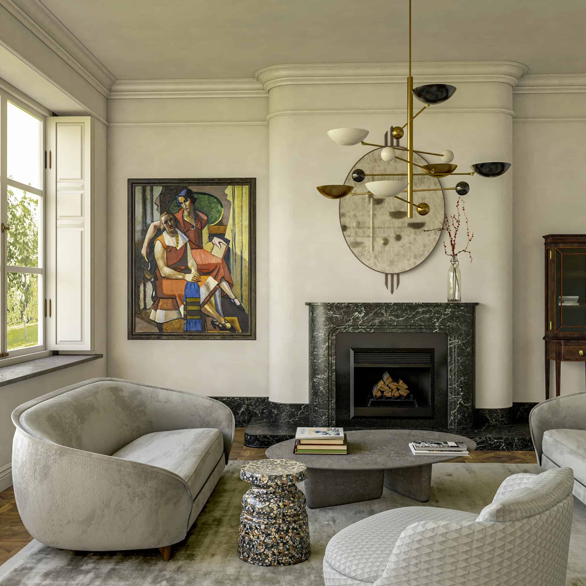 A good palette need not be the first thing we notice. Here it lets the architecture, the dark stone, the art, the textiles and the light sound. Design: Szawrot Design.
The best palette does not look like a demonstration of carefully chosen samples. It makes, rather, a place for the light to settle, lets the materials keep their own character, makes the architecture more legible, and arranges the successive rooms into a coherent but not monotonous whole.
Paint matters in this arrangement. But it does not stand at the beginning of the process. It appears at the end — as an answer to the place.
FOOTNOTES
- Josef Albers, Interaction of Color, 50th Anniversary Edition, Yale University Press, New Haven–London 2013; especially the sections on the effect of the ground, the relativity of colour perception and the “subtraction of colour”. The book first appeared in 1963.
- Ian C. Bristow, Interior House-Painting Colours and Technology, 1615–1840, Yale University Press, New Haven–London 1996. Bristow discusses historic pigments, binders, oils, resins, solvents, water paints, ways of mixing colours and techniques of applying coatings.
- Ian C. Bristow, Architectural Colour in British Interiors, 1615–1840, Yale University Press, New Haven–London 1996, pp. 54–55. The term dead white denoted a matt oil finish achieved by the proper preparation of the final coat, not simply any matt white paint.
- David Coles, An Illustrated History of Colour, Thames & Hudson, London 2018, entries “Emerald green” and “Scheele’s green”. Scheele’s green (copper arsenite, 1775) and the emerald green that improved on it (copper aceto-arsenite) were among the most popular greens of the nineteenth century despite their known toxicity; emerald-green paints were still being withdrawn from sale in the second half of the twentieth century.
- William Morris’s letter to Thomas Wardle of 3 October 1885; quoted after Lucinda Hawksley, Bitten by Witch Fever: Wallpaper & Arsenic in the Nineteenth-Century Home, Thames & Hudson, London 2016. Morris — designer of the most celebrated wallpapers of the age and a shareholder in the Devon Great Consols mine, one of Britain’s largest arsenic producers — dismissed reports of the harmfulness of green wallpapers as medical hysteria. Later research (among others by Andrew Meharg) has in turn cooled the most sensational estimates of the victims of “poisonous wallpaper”.
- Roger W. Moss (ed.), Paint in America: The Colors of Historic Buildings, Preservation Press–John Wiley & Sons, Washington, D.C.–New York 1994, especially pp. 161–166 on the relations between the porosity of a coating, the scattering of light and the change in the appearance of a colour after the application of consolidants.
- Ibid., the chapters on the ageing of historic paints, including the yellowing of oil binders, the loss of sheen, chalking, and changes caused by light and by storage conditions.
- Ian C. Bristow, Architectural Colour in British Interiors…, pp. 61–67. Bristow discusses, among others, the widely used groups of colours known as common colours: whites, creams, stone, pearl, lead and chocolate colours, and colours intended for panelling and joinery.
- Ibid., p. 67. In Alexander Emerton’s price list of 1734 the basic whites, creams and stone colours cost about 4–5 pence per pound, while the best deep green was priced at 30 pence per pound.
- Ibid., pp. 54–65 and further examples discussed in the book. In some eighteenth-century British interiors, dark, chocolate-coloured or mahogany-imitating doors and dados were combined with light mouldings, panelling or plaster.
- John Gage, Colour and Culture: Practice and Meaning from Antiquity to Abstraction, Thames & Hudson, London 1993, pp. 16 and 22–23. Purple was the most precious dye of antiquity; Pliny describes its extraction from sea snails, and successive Roman regulations narrowed the right to wear it, until in Diocletian’s price edict (early fourth century) the best purple wool reached a value comparable to gold.
- David Coles, An Illustrated History of Colour…, entry “Tyrian purple”. The dye, obtained from the gland of snails of the murex family (among them Bolinus brandaris), was reserved for those of the highest rank; the method of its manufacture was in time forgotten, and its chemical composition — 6,6′-dibromoindigo, a close relative of indigo — was deciphered by Paul Friedländer in 1909.
- Michel Pastoureau, Blue: The History of a Color, Princeton University Press, Princeton 2001, pp. 132–134; D. Coles, An Illustrated History of Colour…, entry “Prussian blue”. Prussian blue arose in Berlin around 1704–1706 through the accidental use of potash contaminated with the residues of animal blood; after the recipe was published in 1724, the cheap, durable and non-toxic pigment spread across Europe, costing about a tenth the price of ultramarine.
- Patrick Baty, Nature’s Palette: A Colour Reference System from the Natural World, Thames & Hudson, London 2021 — a visual expansion of Werner’s Nomenclature of Colours (A. G. Werner; Patrick Syme, 1814 and 1821). Baty places Syme’s chart at the head of a long line of colour references reaching down to the British Standard range of paint colours of 1972. It was the 1821 edition that Charles Darwin carried aboard HMS Beagle, using it to record the colours of what he observed.
- Ian C. Bristow, Architectural Colour in British Interiors…, pp. 141–142. William Chambers proposed at the Casino at Marino a white architecture “touched” with blue; technical investigation confirmed the use of blue pigment on selected details of the white mouldings, entablature and panelling.
- Ian C. Bristow, Architectural Colour in British Interiors…, the chapter “The Coloured Neo-Classical Ceilings of Robert Adam and His Contemporaries”, especially pp. 109–110. Historic neo-classical ceilings could be many-coloured, complex compositions, but their palettes were not governed by one universal scheme.
- Mark Wigley, White Walls, Designer Dresses: The Fashioning of Modern Architecture, MIT Press, Cambridge, Mass. 1995. Wigley argues that the “whiteness” of modern architecture is a historiographical construction, and that the modern movement in fact operated a considered logic of the surface and, frequently, of polychromy.
- Barbara Klinkhammer, “The Spatial Use of Color in Early Modernism”, in Legacy + Aspirations, 87th ACSA Annual Meeting Proceedings, 1999. Klinkhammer traces the shared conviction of Bruno Taut, Le Corbusier, de Stijl and the Bauhaus that colour was an integral means of designing space, even as their aims diverged.
- On Taut’s colour work see B. Klinkhammer, “The Spatial Use of Color…”; and Bruno Taut. Meister des farbigen Bauens in Berlin, a monograph devoted to his coloured architecture. Four of Taut’s Berlin estates are inscribed on the UNESCO World Heritage list.
- Arthur Rüegg (ed.), Polychromie architecturale. Le Corbusier’s Color Keyboards from 1931 and 1959, Birkhäuser, Basel–Boston–Berlin 1997. The first Salubra colour collection, with its keyboards of colour, was produced in 1931, the second in 1959.
- On the Rietveld Schröder House (Utrecht, 1924; Gerrit Rietveld with Truus Schröder-Schräder) — the sole full architectural realisation of De Stijl and a UNESCO World Heritage site, cared for by the Centraal Museum, Utrecht. Colour is used to give each plane its own identity and to dissolve the conventional enclosed room.
- Patrick Baty, The Anatomy of Colour: The Story of Heritage Paints and Pigments, Thames & Hudson, London 2017. Baty, a historian of architectural paint and a consultant in the decoration of historic buildings — he runs the family firm Papers and Paints in London — traces the history of interior paints, pigments and colour systems, and the methods of investigating them.
- On the methods of architectural paint research see I. C. Bristow, Architectural Colour in British Interiors…; R. W. Moss (ed.), Paint in America…; and Helen Hughes (ed.), Layers of Understanding: Setting Standards for Architectural Paint Research, Donhead Publishing, Shaftesbury 2002. The study of historic colour requires combining archival documents with sampling, the analysis of layer cross-sections, the identification of pigments and binders, and the interpretation of successive phases of decoration.
- R. W. Moss (ed.), Paint in America…, the chapters on distempers and other water-based coatings. Their solubility meant that during later renovations they could be washed off almost entirely, leaving only fragmentary traces.
- Barbara H. Berrie, “Prussian Blue”, in Elisabeth West FitzHugh (ed.), Artists’ Pigments: A Handbook of Their History and Characteristics, vol. 3, National Gallery of Art–Oxford University Press, Washington, D.C.–Oxford 1997, pp. 191–217. Prussian blue can change its appearance under the influence of chemical conditions, light and the processes of ageing.
- R. W. Moss (ed.), Paint in America…, case studies on the experimental reconstruction of historic recipes and coatings. Technological reconstruction helps one to understand the texture, covering and sheen of an old paint, but it does not automatically yield one incontestable modern colour number.
- The Venice Charter (International Charter for the Conservation and Restoration of Monuments and Sites, ICOMOS, 1964) and The Nara Document on Authenticity (ICOMOS, 1994). The Venice Charter admits in principle only anastylosis — the reassembly of surviving original parts — and treats reconstruction with reserve; the Nara Document holds that authenticity is judged within a cultural context and cannot rest on fixed criteria.
- Barbara Bielinis-Kopeć, Dariusz Markowski, “The interiors of the former sanatorium at Trzebiechów: a work of Henry van de Velde”, Ochrona Zabytków 2006, no. 3, pp. 5–28; B. Bielinis-Kopeć, “The former sanatorium at Trzebiechów”, Ochrona Zabytków 2014, no. 2, pp. 119–138.
Selected Bibliography
Colour perception, colorimetry and light
Albers, Josef, Interaction of Color, 50th Anniversary Edition, Yale University Press, New Haven–London 2013.
Chevreul, Michel-Eugène, De la loi du contraste simultané des couleurs et de l’assortiment des objets colorés, Pitois-Levrault, Paris 1839.
CIE, Colorimetry, 4th edition, CIE 015:2018, Commission Internationale de l’Éclairage, Vienna 2018.
Cuttle, Christopher, Lighting by Design, 2nd edition, Butterworth-Heinemann, Oxford 2008.
Fairchild, Mark D., Color Appearance Models, 3rd edition, John Wiley & Sons, Chichester 2013.
Hunt, Robert W. G., and Pointer, Michael R., Measuring Colour, 4th edition, John Wiley & Sons, Chichester 2011.
The history of colour, its language and culture
Baty, Patrick, Nature’s Palette: A Colour Reference System from the Natural World, Thames & Hudson, London 2021.
Coles, David, An Illustrated History of Colour, Thames & Hudson, London 2018.
Gage, John, Colour and Culture: Practice and Meaning from Antiquity to Abstraction, Thames & Hudson, London 1993.
Gage, John, Colour and Meaning: Art, Science and Symbolism, Thames & Hudson, London 1999.
Hawksley, Lucinda, Bitten by Witch Fever: Wallpaper & Arsenic in the Nineteenth-Century Home, Thames & Hudson, London 2016.
Lowengard, Sarah, The Creation of Color in Eighteenth-Century Europe, Columbia University Press, New York 2006.
Pastoureau, Michel, Blue: The History of a Color, Princeton University Press, Princeton 2001.
Pigments, paints and historic technology
Baty, Patrick, The Anatomy of Colour: The Story of Heritage Paints and Pigments, Thames & Hudson, London 2017.
Bristow, Ian C., Architectural Colour in British Interiors, 1615–1840, Yale University Press, New Haven–London 1996.
Bristow, Ian C., Interior House-Painting Colours and Technology, 1615–1840, Yale University Press, New Haven–London 1996.
Eastaugh, Nicholas, Walsh, Valentine, Chaplin, Tracey, and Siddall, Ruth, Pigment Compendium: A Dictionary and Optical Microscopy of Historical Pigments, Butterworth-Heinemann, Oxford 2008.
Feller, Robert L., Roy, Ashok, FitzHugh, Elisabeth West, and Berrie, Barbara H. (eds), Artists’ Pigments: A Handbook of Their History and Characteristics, vols 1–4, National Gallery of Art, Washington, D.C. 1986–2007.
Gettens, Rutherford J., and Stout, George L., Painting Materials: A Short Encyclopaedia, Dover Publications, New York 1966.
Moss, Roger W. (ed.), Paint in America: The Colors of Historic Buildings, Preservation Press–John Wiley & Sons, Washington, D.C.–New York 1994.
The study of paint layers and conservation
Baty, Patrick, “The Role of Paint Analysis in the Historic Interior”, Journal of Architectural Conservation, vol. 1, no. 1 (1995), pp. 27–37.
Cather, Sharon (ed.), The Conservation of Wall Paintings, Getty Conservation Institute, Marina del Rey 1991.
Horie, Velson, Materials for Conservation: Organic Consolidants, Adhesives and Coatings, 2nd edition, Butterworth-Heinemann, Oxford 2010.
Hughes, Helen (ed.), Layers of Understanding: Setting Standards for Architectural Paint Research, Donhead Publishing, Shaftesbury 2002.
ICOMOS, The Venice Charter (International Charter for the Conservation and Restoration of Monuments and Sites, 1964) and The Nara Document on Authenticity (1994).
McDonnell, Phillipa, “Architectural Paint Research and the Archaeology of Buildings”, The Archaeological Journal, vol. 177, no. 1 (2020), pp. 140–166.
Colour in architecture and modernism
Klinkhammer, Barbara, “The Spatial Use of Color in Early Modernism”, 87th ACSA Annual Meeting Proceedings (Legacy + Aspirations), 1999.
Porter, Tom, and Mikellides, Byron, Colour for Architecture Today, Taylor & Francis, London–New York 2009.
Rüegg, Arthur, Polychromie architecturale: Le Corbusier’s Color Keyboards from 1931 and 1959, Birkhäuser, Basel–Boston–Berlin 1997.
Bruno Taut. Meister des farbigen Bauens in Berlin — a monograph on Bruno Taut’s coloured architecture in Berlin.
Wigley, Mark, White Walls, Designer Dresses: The Fashioning of Modern Architecture, MIT Press, Cambridge, Mass. 1995.